Contents
3 graphic design tips for non- designers and beginners
Graphic design tip #1: Select your fonts or typefaces
Graphic Design tip #2: Use the right scale for each text
Graphic Design tip #3: Give equal importance to space in your design
3+ Best graphic design tips for non-designers & beginners [Updated for 2021] + a look into our organization's design process
Jagadeash - July 14, 2021 - Leave your thoughts.
We went through Google and sought to learn about the best graphic design tips for non-designers and beginners.
But we weren't satisfied.
Most of the posts were basic or missed some very important points.
So we went ahead and put together this FREE guide with 3+ graphic design tips for non-designers and beginners.
If you want to go from a total newbie to a graphic design pro, check out this guide. We are sure that this will be a game-changer for you.
3 graphic design tips for non- designers and beginners
We interviewed a bunch of designers in our own organization for this guide. We wanted to make sure that this guide came from the perspective of someone with innumerous experiences in the field of design.
Here we go
Graphic design tip #1: Select your fonts or typefaces
Before we get into fonts and typefaces, it's essential that you understand the difference between them.
What is the difference between a font and a typeface?
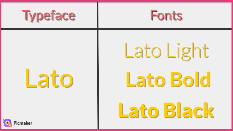
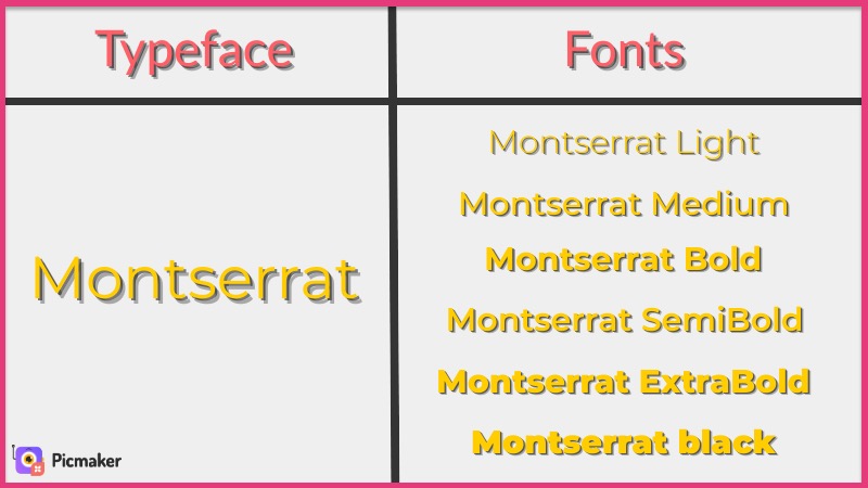
A typeface is a collection of fonts, while a font is just a modified version of a typeface. Here are some examples to help you understand the difference between typefaces and their fonts.
Here is another example of the fonts in the Montserrat typeface.
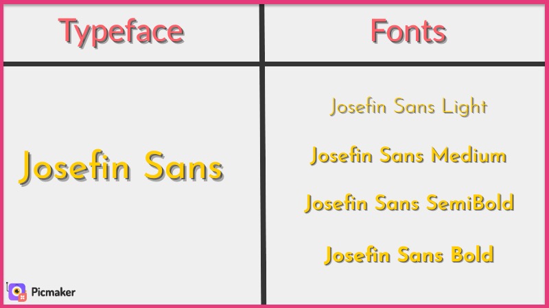
Here is one final example of the fonts based on the Josefin Sans typeface.
But selecting the right fonts for your design is hard!
That's exactly what we also thought before having a chat with Vignesh from our design team. Here's what he had to say about selecting the right font for your design.
"Choosing your fonts depends on your design and its purpose. If you're going to design something related to weddings, use something classy like Serif or floral fonts."
The screenshot below explains a sample list of the fonts that can be used for a wedding-themed design (which can be created using a free online invitation maker).
You should aim to use a font that is elegant and classy for these designs.
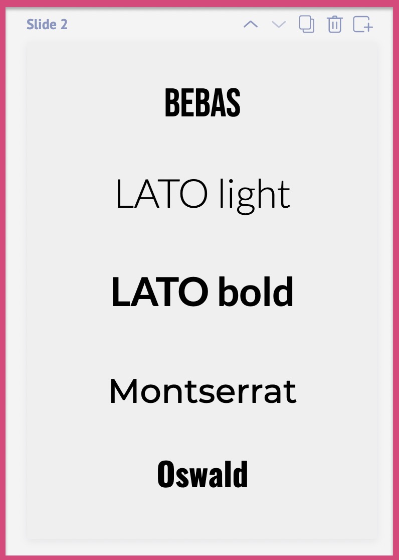
"On the other hand, if you're creating a graphic for your business, it must look professional. Some examples of the professional font include Bebas, Lato, Oswald, etc."
Every font has a purpose and a place. Be wise when you are choosing fonts for your design. Understand the purpose of your design.
Here is a 4-step process to help you select the right fonts for your design.
Step 1: Understand the purpose of your design
Step 2: Choose a primary font
Step 3: Choose a secondary font
Bonus step: Change the alignment and spacing of your fonts
STEP 1: Understand the purpose of your design
What's the purpose of your design?
Will it be used on a Facebook ad or an IG story?
Will it be used on a business proposal or a wedding invitation?
You need to be clear about the purpose of your design before you can start designing it. Most of the graphic design tips for non-designers start with understanding purpose.
STEP 2: Choose a primary font
Once you have identified your graphic design's purpose, choose a primary font for that design. This primary font will be used on your headline and titles. Your primary font will majorly influence the mood and feel of your design.
Here are some tips to pick the right primary font for your design
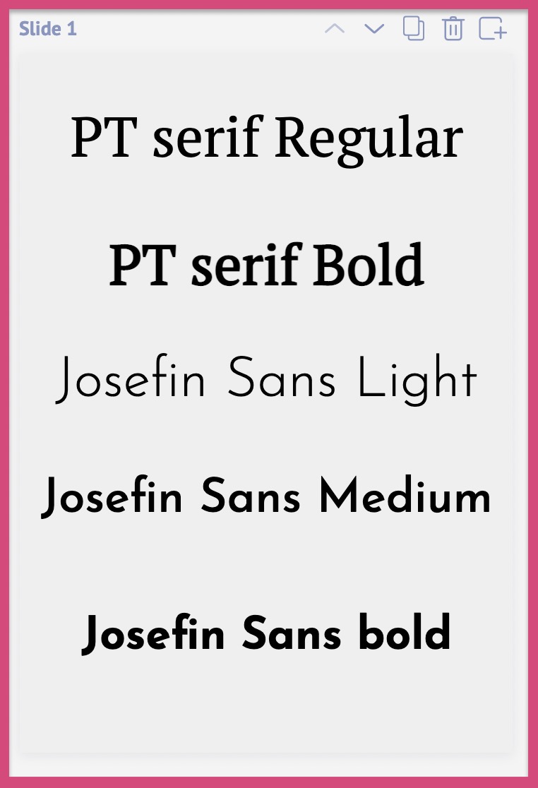
Tip 1: You can start by choosing a Serif or a Sans font.
What's the difference between a Serif and a Sans font?
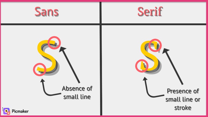
The small line or extension is the only difference between a Sans font and a Serif font. Apart from that, they have no major difference between themselves.
With that said, here is a small list of all the fonts you can use as your primary.
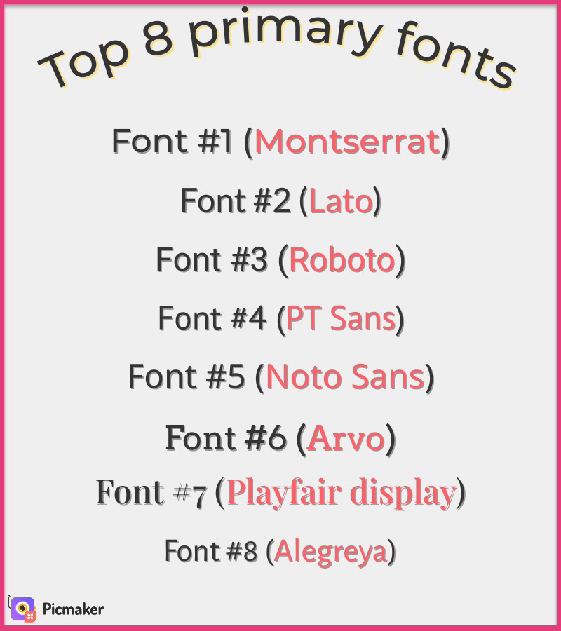
You can choose any font from this list to use as your primary. But these are not the only options at your disposal. You can always be creative with more font choices.
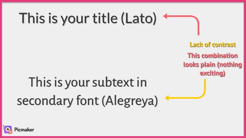
STEP 3: Choose a contrasting secondary font
Your secondary font should complement your primary font. It should not be similar to the family of your primary font. That's how you make your design look interesting.
Here's what you shouldn't do
Now let's replace the font with something that's different from the primary font.
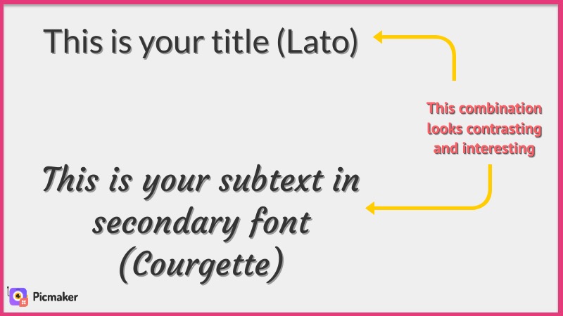
Doesn't it look much better now?
This is exactly what you should aim for with your font choices. You should look for a secondary font that complements your primary font.
BONUS STEP: Change the spacing and alignment of your font
Here's something interesting: The same font can be customized to look completely different. Yes, this is a trick our designers use in most of their designs.
But how can I do this?
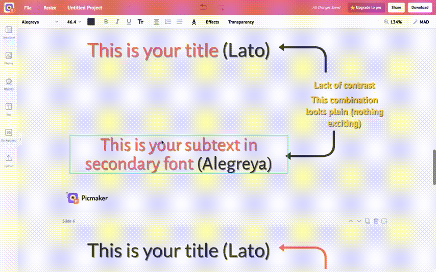
Fret not, because we have added these cool features inside Picmaker. It gives you the ability to customize and align your font in the following ways.
- Change the text aligment
- Change the spacing between each word
- Change the line spacing
You can do all these manipulations to make the same font seem wildly different. Take a look at this GIF below to get an understanding of what we mean by "font customization".
Here are some examples from Picmaker
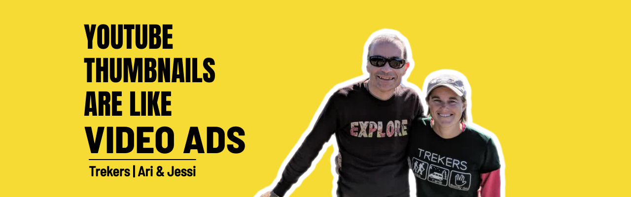
1. Font selection in this YouTube thumbnail template
This YouTube banner template has just one font for both it's primary and secondary. The font used here is "Montserrat Black".
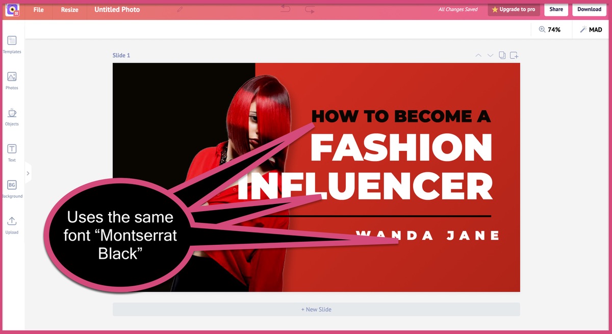
But the font on the title looks different from that of the name.
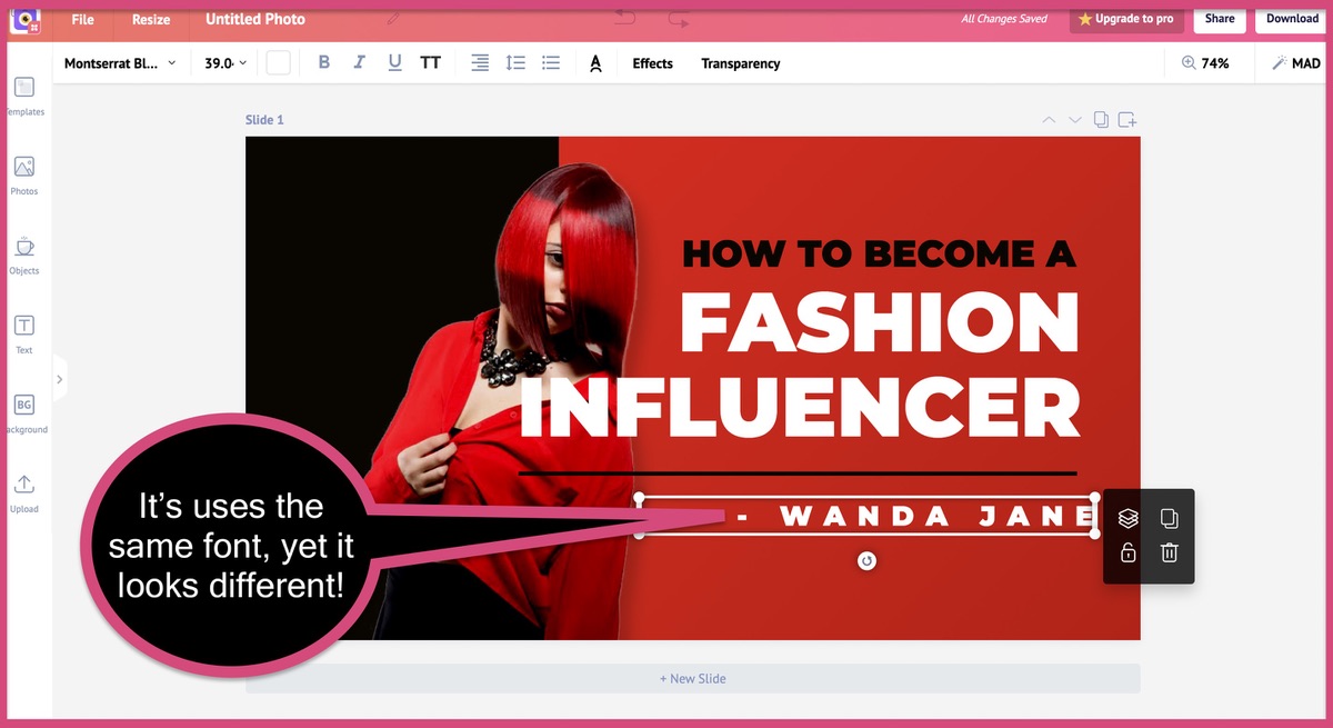
If you're wondering how our design team made the same font look different, here's your answer.
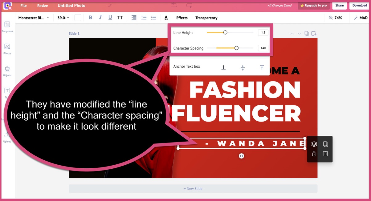
They have used Picmaker's advanced feature to vary the "line-height" and "Character spacing". One small modification and now the font looks totally different. Now that's the power of using an advanced design tool like Picmaker.

2. Font selection on this Flyer template
Let's take a look at the font choices on this flyer template created by our design team. They have three different fonts in this flyer. This proves that you can also add three different fonts to your design and make it look good.
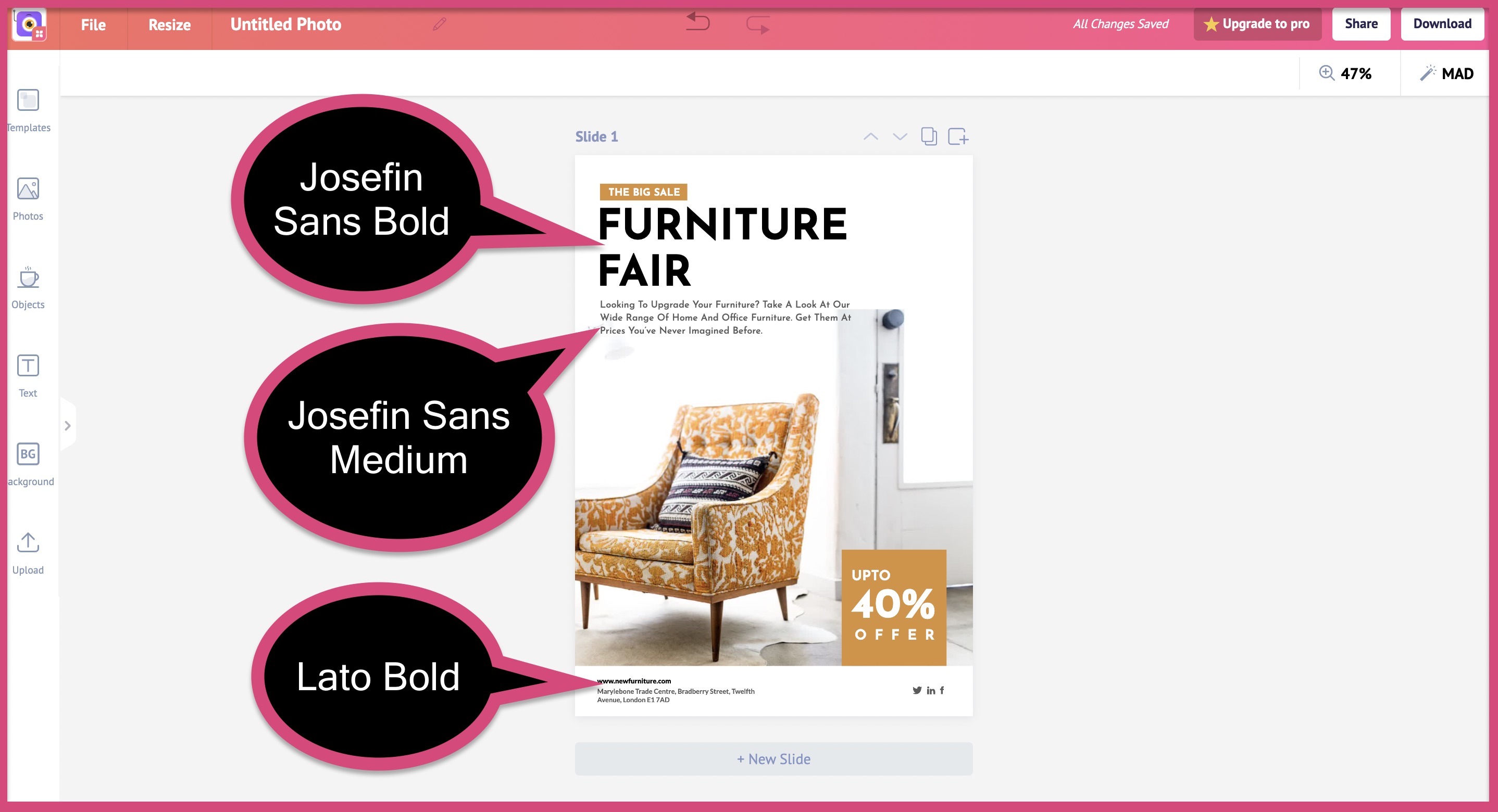
They have carefully varied the size and alignment of each text to create a kickass flyer design.

Graphic Design tip #2: Use the right scale for each text
This follows up on the first tip - selecting a font. Once you have selected the primary, secondary and tertiary fonts, you need to scale them right.
What do we mean by scale for text?
Let's consider one of our poster templates as an example
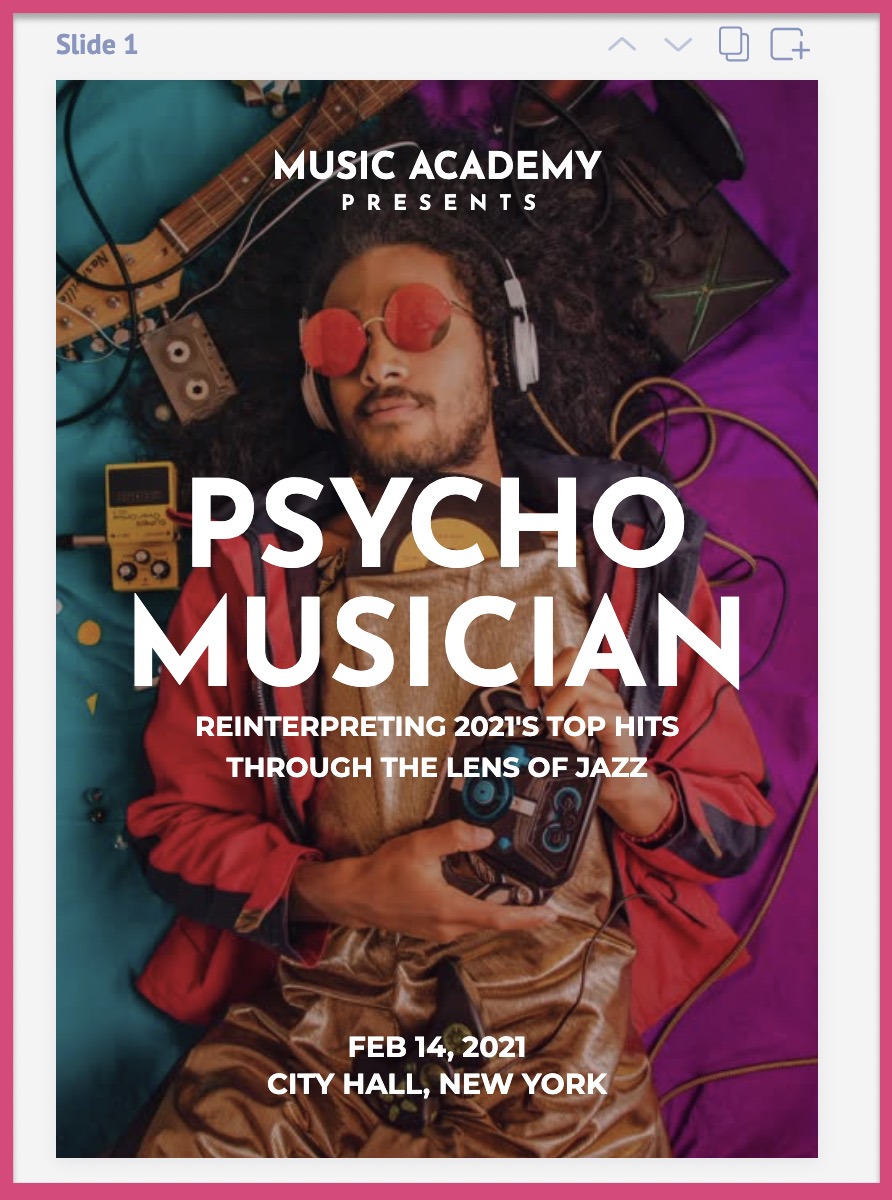
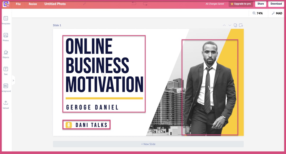
Take a good look at this poster template and you'll understand how each text is scaled in the design. The words "psycho musician" are the largest, followed by all other texts.
Each piece of text has its role to play in your design. You should scale the text based on its importance and function in the design. Take a look at the screenshot below to understand how each text is scaled.
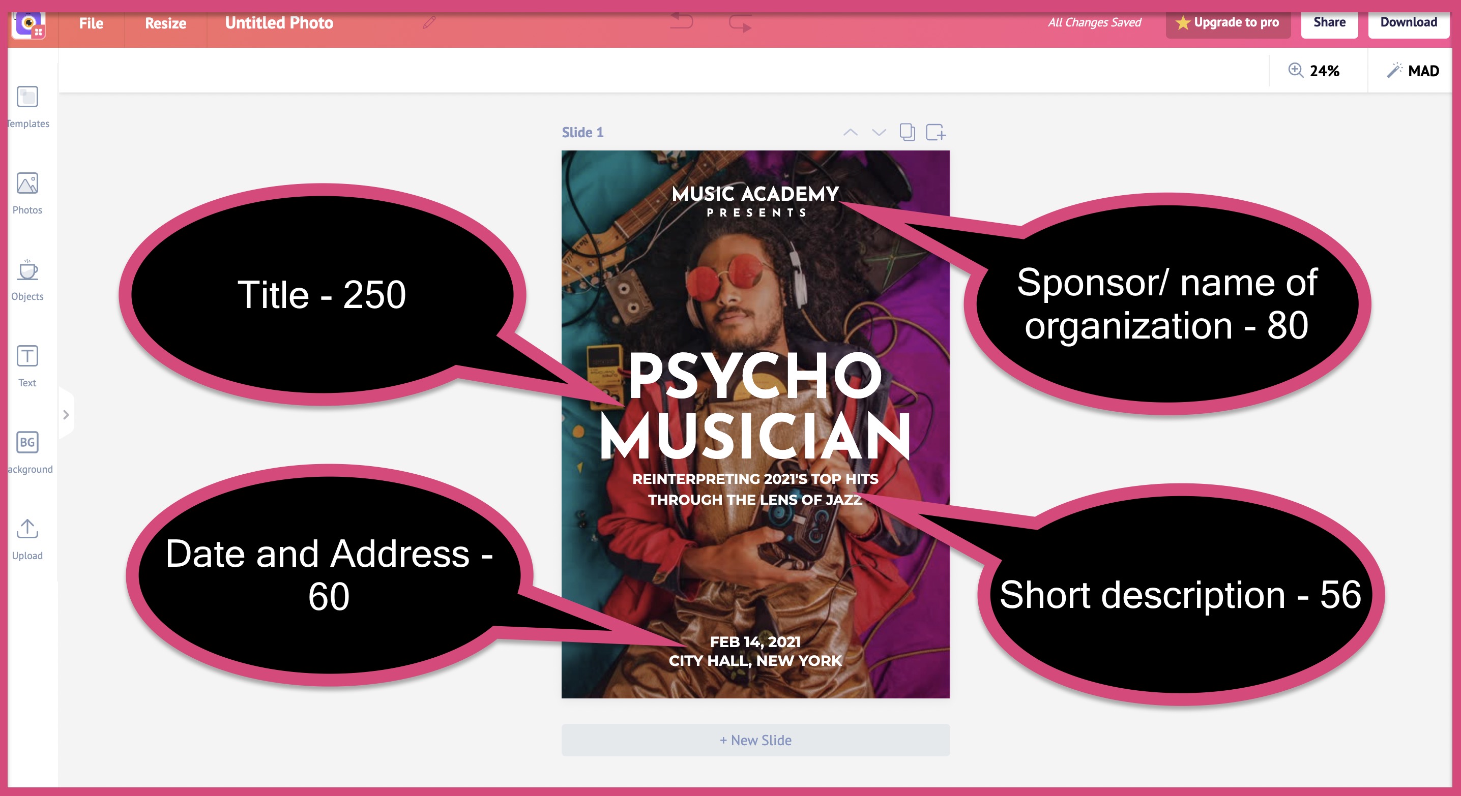
The title text is the largest, followed by name of the organization, address, and short description.
Let's take a look at another poster to understand how scaling is arranged in a design.

Here's another poster template designed by our team.
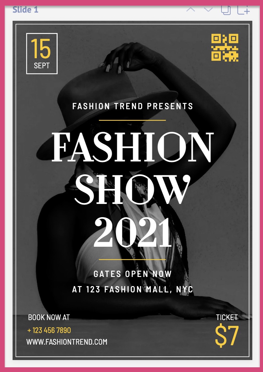
Let's take a look at the text scale in this poster design. Just like the last poster, we'll try to understand the scale of each text element.
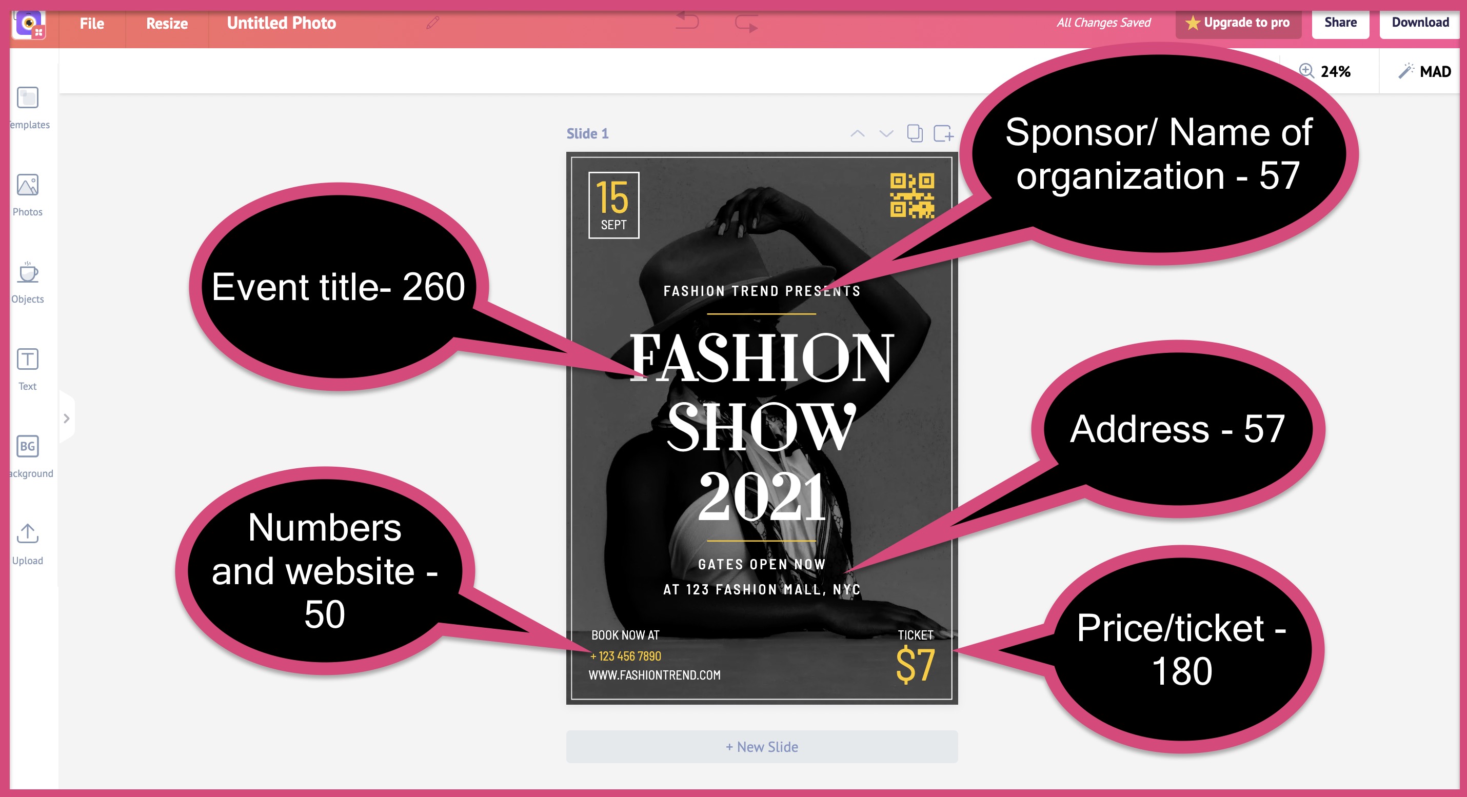
We are able to derive the same pattern from this poster. The name of the event/ title has been scaled to the highest size. It is followed by the cost of the event. After which it is a tie between numbers, website URL, Name of organization, and address.

From this short analysis, you can get an idea of how a text element must be scaled on your design.
The most important component of your text should be the largest.
For posters, this might be the event name and title.
For flyers, this might be your offer, discount, or the name of your organization.
For YouTube thumbnails, this might be the title of your video.
Make sure that the most important text is always the largest on your design. After this, you can follow up with the next set of text elements like price. Finally comes your address, website URL, phone number, date, contact details, etc.
There is no one hard fast rule to approach this method. But always remember this
"The most important text of your graphic must always be the biggest in scale"
The most important text will change depending upon your goals, type of design, and dimension. Identify the most important part of your design and make it the largest.
Let look at some more design examples to get a better idea of this
1. Blog banner templates

The 'title' of the blog post is the biggest text. It is closely followed by the name of the author. You can also see how the text "5 ways" has been strategically highlighted in this design. This is how you get creative with your design.

Just like the previous blog banner, the keyword "income-driven" has been strategically highlighted here. You can also add graphics to your design to add some variety and life to it.

The designer has highlighted the number '10' to make it stand out in the title. Technically the number '10' is the largest text in this banner, which is then followed by the rest of the title. Finally, you have the name of the author below everything.
You can see how the designer has used the background picture to his advantage. You should also aim to use background pictures and graphic elements in your design. The right elements will take your design from 'okay' to 'wow'.
2. Instagram post templates

This is a social media post and hence it makes sense for a phrase like "push your limit" to be the biggest in scale.
Followed by that is the text "join now" inside a box. This serves as a call to action, pushing the user to click on it. You will never see CTA's like this on a YouTube banner of 2560x1440 pixels, but they are pretty common on IG posts and ads.

This Instagram post is used to spread the message of "Stop Racism". The designer has perfectly captured that emotion by adding these words beside a black man in the background.
This is one of the best examples of your text and background picture working in tandem.

The names of the bride and groom are the biggest size in this wedding post. It's followed by the location, time, address, and other details. For any wedding-related designs, the name of the bride and groom should always be the biggest. That's a rule that's never meant to be broken.
That's the exact reason why context plays a very important role in your design.
3. Facebook Ad templates

Designing a successful Facebook ad template is difficult when compared to other formats. You need to add the right CTA, color, and design elements to make it disruptive. This Facebook ad template created by our team is a good example of the perfect Facebook ad.

The words "Big sale" have been perfectly scaled to capture the attention of the user. The "40%" discount is next on the scale. As we mentioned earlier, the offer is an important part of Facebook ads. Therefore it has been given the highest scale in the text.

This Facebook ad can be used to advertise your offers on black Friday. Since Black Friday is the main theme here, this text is of the highest size. The "70%" discount is the next highest in scale after the name of the main event.
Graphic Design tip #3: Give equal importance to space in your design
This is a small but important tip.
Always pay attention to space in your design.
You should never cramp up your design to the brim. There should be considerable breathing space between different elements in your design.
There are two types of spaces in graphic design
- Positive space
- Negative space
Positive space refers to the space occupied by the object. While negative space refers to the space that is not occupied by the object. The background color is a good example of negative space in your design.
The area inside the pink boxes is your positive space. All the area outside the pink space is the negative space.
This YouTube thumbnail has a ton of negative space (background elements and colors). But this ratio will be totally different on a different design. For example, let's consider one of our brochure templates.
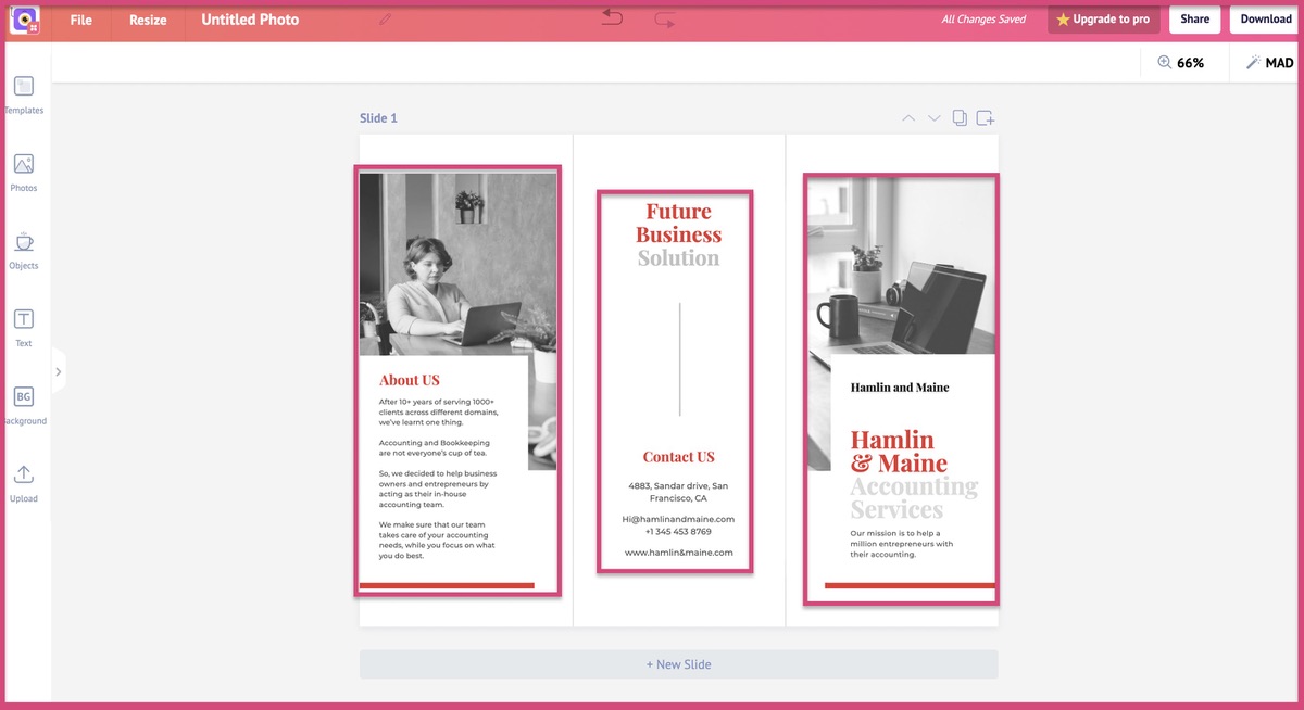
As you see in the screenshot above, the ratio is completely different here. Spacing depends upon the type of design.
This is how a YouTue thumbnail would look if we didn't pay importance to proper spacing.
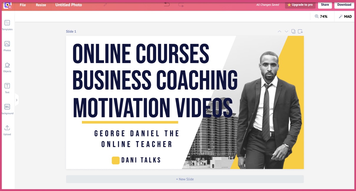
Do you see how cramped it has become by adding just 6 extra words?
The next time you want to add more elements to your design, take a pause and ask yourself these questions.
Will it cram my design?
You will thank yourself later.
What is our graphic design process?
Picmaker is a design tool that helps you create designs with ready-made templates. So naturally, we create a lot of design templates here. This means that we have a tried and tested design process to create these templates. Here is what one of our designers had to say about our design process.
- Take a look at the content and understand the usecase of the design
- Gather images and illustrations for the design
- Select a background that is relevant to the images and illustrations
- Place the text on the design and add the right colours
Our design team uses this simple process to create templates across hundreds of categories.
We have 3 examples from some of our categories below.
1. YouTube banner templates


2. YouTube thumbnail templates


3. Flyer templates


4. Poster templates


5. Logo templates


6. Facebook Ad templates

7. Twitter ad templates


8. Brochure templates


9. Card templates


10. Whatsapp story templates


11. Facebook story templates


12. Instagram story templates


Creating all these templates was no easy task. So we needed to have a process to design these templates effectively. So our design team uses the 4 step process to create these design templates at scale.
Here's what our designer had to say about this process
"For every design, we need to understand the use case and feel of that design. We need to understand if it's an IG post, YouTube banner, blog banner, or a wedding invitation."
The shapes, images, and colors for your YouTube channel's banner will be totally different from that of a wedding invitation.
Even if it's a YouTube banner, we need to understand why that banner is created.
A gaming YouTube banner, for example, will be completely different from the one that's related to a Yoga themed banner.
Understand the use case of your graphic design
Design accordingly
We hope this guide was helpful to you.
Thanks for reading.