10 Logo Design Tips To Create A Unique Logo
It was late 2016, and everything around seemed normal. Until StatCounter, an online visitor tracker reported something unheard of. It got a lot of people talking (mainly about logo and branding).
For the first time, internet usage on mobile and tablet devices exceeded desktop internet usage—by 51.3 percent to 48.7 percent in October that year. It changed how digital strategists, marketers, and brand managers approached branding, including making a logo.
Awareness had already been rife that mobile devices were going to be a big part of the future, but here was the first evidence of the expected evolution. Companies now had to factor in the changing consumer habits before embarking on any branding activity.
Logos, in particular, underwent a massive change as one big brand after another began reworking their identities to make them responsive on different screen sizes.
ALSO READ: The Uncomplicated Guide to Design Your Brand Identity for Free in 5 Minutes
They had to be simplified to fit them in 720x1280 pixels screens, notwithstanding which they had to remain recognizable and memorable. After all, customers recognize and remember brands through their logos.
However, personal preference (subjectivity, in other words) is an inherent part of conversations about logos. So much so that even graphic designers may find it to be somewhat of a puzzle.
To know what makes a good logo, you must think objectively. Here are some questions you should ask before designing:
- What best represents the brand/company?
- Who are our target audience?
- Will it be memorable for decades to come?
- Is the logo visible irrespective of its color and size?
- Which fonts and colors suit our brand the best?
A great logo must create an impression and kindle curiosity in the audience to learn what it signifies. Logos incorporate design to distinguish themselves from their competition while indicating the ownership of a brand in the marketplace. A well-designed symbol accomplishes a company’s branding objectives, just as it serves as a reference for the audience.
Types of Logos
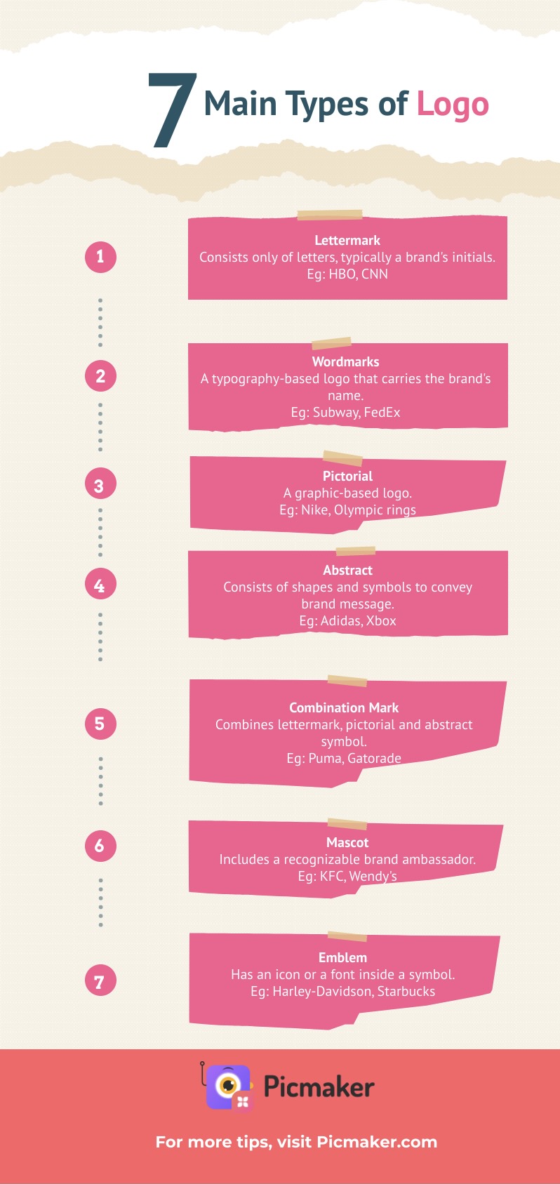
At a fundamental level, a logo is simply an image that symbolizes a brand. It can, however, be classified into seven different types.
1. Lettermark (a.k.a monogram) logos
This type typically only consists of letters, normally a brand’s initials. BBC, CNN, HBO, and HP are examples of monogram logos that symbolize brands with lengthy names, but who have adopted the use of initials for brand identification.
Monogram logos offer simplicity while being easy to remember. For example, how simpler is it to say HBO instead of Home Box Office, particularly when communicating?
A pro tip: To design this type of symbol, which only consists of a brand’s initials, the choice of fonts must not only be on-brand but also be clear enough to print on business cards.
2. Wordmarks
Similar to letter marks, wordmarks are typography-based logos that carry a brand’s name. Restaurant chains Subway, Linked In, FedEx, and eBay are prime examples of brands that have wordmark logos.

What is also noticeable is that the brand name is both short and unique, which, in combination with prominent typography, helps with brand identification.
For wordmark logos also, designers must carefully consider their choice of font to ensure they are on-brand and reflective of what the brand stands for.
3. Pictorial
This is a graphic-based design, also known as logo symbol and brand mark. Nike, Olympic rings, and Domino’s Pizza are examples of brands with Pictorial or logo symbols.
Being household names, the logo makes them easily recognizable. Conversely, this may not be suitable for brands that aren’t as established or whose brand recognition is not as strong.
However, if your brand chooses to go with a pictorial symbol, you must carefully consider the image you choose as it’s going to remain constant.
4. Abstract logo
These logos express wide-ranging concepts and feelings with one symbol, making them a popular choice for brands that have plenty to say.


These logos typically consist of shapes, patterns, illustrations, line symbols, and more that convey a brand’s message with non-literal imagery.
Adidas, Xbox, and PlayStation are examples of brands with an abstract symbol, whose key benefit lies in communicating a brand’s message using symbols. The use of colors and shapes elicits brand sentiment and emotion.
5. Combination mark
As the name suggests, a combination mark combines lettermark, pictorial and abstract symbols. Picture and text can either go side-by-side, be integrated as one to create an image, or be stacked one over another.

Adobe, Puma, and Gatorade are popular examples of combination marks that strengthen the brand-audience connection.
An advantage of combination marks is they are easier to trademark than, say, a pictorial logo because the text and the symbol fuse together to create a unique distinction.
6. Mascots
These logos include an easily recognizable brand ambassador in their design and make a particularly great choice for brands that want to cater to children and families. Companies also use mascot logos when their primary motive is to entertain.
KFC’s features Colonel Sanders, Melinda Lou is featured on Wendy’s, and so on.


Mascots are closely associated with sports, where it first became a concept in helping stimulate excitement among the audience.
Brands that choose to use a mascot logo must take into account whether they want their illustrated character to be a serious or playful character to fit the brand theme.
7. Emblem
This logo has an icon or font inside a symbol.
Starbucks’ mermaid emblem and Harley-Davidson’s prominent crest are prime examples of emblem logos which are also commonly seen on badges, crests, and seals.


These logos often strike a traditional appearance and, therefore, are a popular choice for schools, government organizations and agencies. The traditional design also makes them less versatile for most other brands to adopt.
A pro tip: For brands that want to adopt an emblem logo, design simplicity is key to creating an elegant, bold look.
3 logo design principles you must follow
The process of designing a logo is easier when the approach is backed by thorough research, sound planning, knowledge, and experience.
Knowing some of the key principles, along with the fundamentals of graphic design, provides the foundation to create something unique and impressive. An awareness of the brand’s target audience and the type of messaging you want to foster is also vital.
1. Uniqueness
We can never stress enough the importance of a unique logo.
A logo will attract and remain in the memory of the audience only if it’s unique and easily distinguishable.
Think of those that are memorable to you and understand what sets them apart. That’s a good starting point for designing your own.
When you look closely, you’ll probably notice the use of blue in most designs. Blue is the first-choice color. It symbolizes a brand’s professionalism and rationalism, fostering a sense of trust and security in a brand.
Green, purple and red are also good colors to use for your logo to distinguish it. Magenta, teal and turquoise are excellent color choices, too.
Above is a unique logo for a professional photography studio. It's a minimalist design with a unique touch.
2. Balance + Proportion
Designing with the right balance and proportion is key to appeal to people’s senses.
This essentially refers to the distribution of elements in a design to create a visual appeal. Not all design elements need to be distributed symmetrically but it’s important that color, contrast, typeface, and scale are balanced and have an equilibrium.
Proportion is the weight of each element that’s part of a logo. Striking the right proportion will give it a wholesome look.
Above is a logo that incorporates balance and proportion to give it a professional, wholesome look.
3. Scalability
Scalable logos are adaptable to different sizes and thus become a voice for your brand anywhere.
They can be printed on large billboards while being adaptable to also be etched on smaller objects.
However, scalable logos must look their original self and be easily recognizable regardless of where they’re printed.
The key to achieving scalability is to not include too many details. The designer must also create the design in vector format, which helps with rescaling the design.
Above is an example of a scalable logo. The designer has opted for simplicity while experimenting with the typeface to lend elegance and ensure it stays in the minds of viewers.
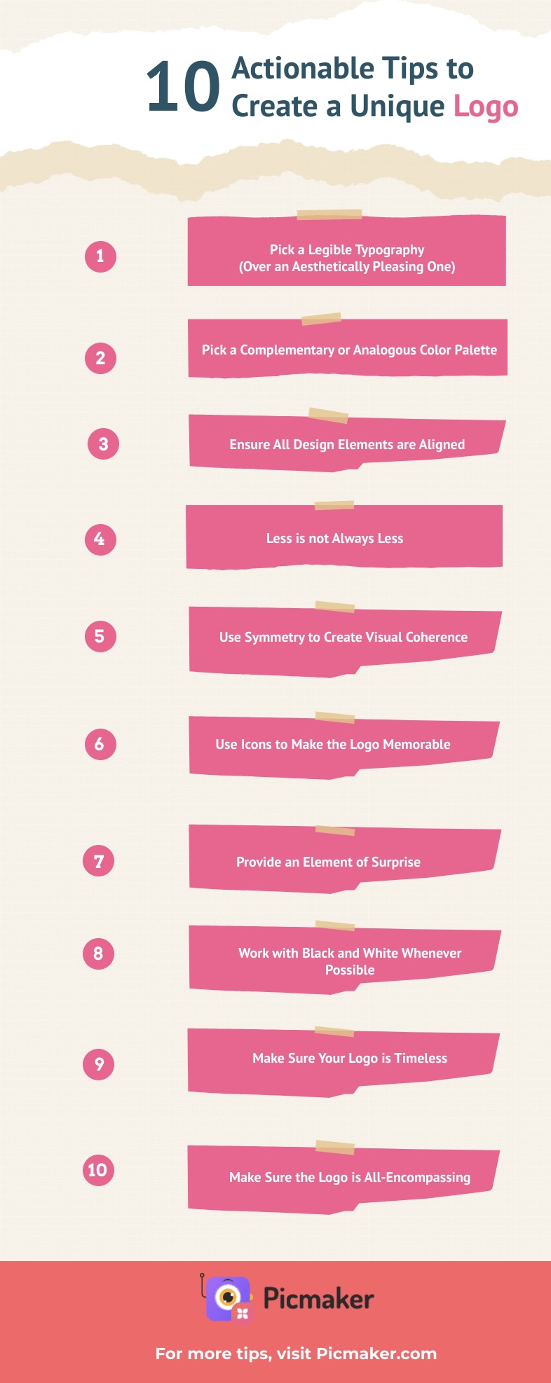
10 Design Tips to Create Your Own Logo
The principles of making a good, impressionable logo might sound simple and clear. However, knowing where to start and putting your ideas into action can be challenging, whether you're a beginner or someone seasoned with design.
Don’t worry, the following list of design tips will help you create a unique brand logo.
1. Pick a legible typography (over an aesthetically pleasing one)
Choose readable, web-friendly fonts such as Montserrat, Helvetica and Lato to make your design polished and professional. More importantly, using a legible font is key to effectively getting your message across, while retaining the reader’s interest in your logo.
The above template uses Montserrat font with subfamily “ExtraBold” applied to the title ‘Alpha’ and “Medium” applied to ‘Constructions’.
Not only is Montserrat a great choice of font, here it informs the viewer of the brand name instantly, while the distinction in font sizes makes it memorable.
If you choose a brush script or handwritten font, ensure that the text is legible even if the size is small.
Remember: Legibility should not be compromised for any decorative element that you may want to incorporate in your design. As you design your logo, it’s possible that you cut off letters, change fonts and tweak the typefaces. Make sure that none of these affects your design’s legibility.
2. Pick a complementary/analogous color palette
Colors have the inherent ability to elicit primal sentiments in people. A great logo takes advantage of this attribute to emotionally connect with the audience.
The right color scheme will create positive feelings such as happiness, warmth and well-being. Whereas an incongruent color scheme could trigger negative feelings.
Picking a complementary or analogous color palette is a great way to bring out positive feelings in people.
A complementary color palette uses colors that are at opposite ends of the spectrum. This creates contrast and persuades the viewer to pay attention to the logo.
Take this as an example. Black and white provide the maximum contrast possible but are regarded as a contrast of value. Also, big differences in lightness are deemed pleasant for the human eye. Along with the choice of color palette, the minimalist design makes it easier for the viewer to focus on the logo.
The designer has implemented an analogous color palette for this minimalist logo, with the use of yellow and orange - the two most vibrant colors on the color wheel.
3. Ensure all design elements are aligned
Spacing and alignment can make all the difference, by either capturing the audience’s attention or failing to make an impression. Essentially, the designer must ensure that text and word spacing, design elements, and margins are centered and even.
Proper alignment provides balance and gets the viewer to focus on the key elements of the design.
The logo above features multiple layers of text along with a cup and saucer set, but everything is aligned and balanced. The line-spacing is even, which makes it uncluttered and easier to focus.
4. Less is not always less
The saying “Say more with less” is essential to bear in mind when designing a logo.
Not all logos have to be minimalist, of course. But, if you can create a simple design that conveys your intended message, then it’s not necessary to crowd the design with undue elements.
Ensure, however, that the visual elements you include create a lasting impression on the viewer.
Here’s a minimalist logo that still does its job of communicating the main message.
5. Use symmetry to create visual coherence
Visual coherence is nothing but ensuring the visual elements are balanced throughout.
Symmetry is a big part of all that is aesthetically pleasing to the human eye. Not to mention it also makes the design look professional and organized.
Design symmetry can be achieved in different ways - one of which is by providing equal spacing around the text.
The logo above is an example of a symmetrical design with even spacing around the text, which is centrally aligned.
6. Use icons to make the logo memorable
Long after a viewer has come across a brand symbol, what sticks with them is not the text or the color scheme. Instead, it’s the iconography that remains in the memory.
Take this as an example. The designer has creatively included the “Knight” as part of the letter ‘h’ to make the logo stand out and memorable.
Not only does the icon feel contextual in the way it’s used, but it also stands as a symbol for the chess academy, “Rough Horse”.
7. Provide an element of surprise
People love mysteries and novelty. If your design can capture the viewer’s attention and transfix their eyes on the design longer, it will lead to better memory and recall.
Therefore, once you’ve nailed down the fundamentals, think how you can add personality with an element of surprise.
After all, what is a logo if it doesn’t reflect the uniqueness of your brand?
Here’s a logo with an element of surprise. The letters ‘u’ and ‘h’ are intricately connected to form a glass that contains juice.
While it has the brand name “Juice Shop”, the quirk played by the designer makes it more memorable. At the same time, the design is simple and appropriate.
8. Work with black and white whenever possible
Try not to crowd your design with excessive colors or textures. This will make it easier for you to focus on the key features: contrast, hierarchy, and readability.
A black-and-white color scheme helps you achieve simplicity with your logo, while it also drastically improves the effectiveness of your design.
In the logo above, the designer has employed a minimalist color scheme. The background is white and the font used is Norwester, part of the Sans Serif font family, which helps with readability.
9. Make your logo timeless
Timelessness is another important trait of an excellent logo. You don’t want your brand identity just for the now and tomorrow.
All logos are updated now and then to retain freshness, but a great logo today must remain great 10, 15, 30, or even 50 years down the line.
Creating a timeless logo is easy when you follow a few general rules, such as:
- Choose classic fonts
- Stick to two or three colors
- Keep it simple but bold
- Make it easily adaptable for print and digital platforms
The logo above has the characteristics of a timeless one. The designer has incorporated only a few colors, the design is simple but memorable, and the font used (Arvo) is a geometric, slab-serif typeface that’s suited for print and digital media.
10. Make sure the logo is all-encompassing
A designer incorporates various elements into a logo to capture the essence of the company and create a single image that stands the test of time.
A great design should encompass both the brand message and the marketing message that the company wants to convey to its audience.
The logo above has all the qualities that make it all-encompassing. The messaging is direct and clear, while the text and shapes give it a modern and classic look.
Key Takeaways for Your Next Logo
- Your brand identity should be unique and must resonate with the audience to make it memorable.
- Logos can be classified into seven different types. Pick a type that best suits your brand (based on the industry you are in) and the audience you’re trying to reach.
- In addition to being unique, it must incorporate balance and proportion, and be scalable.
- Ensure the logo is legible, timeless and has a surprise element to it.
- Use icons and symmetry to appeal to people’s senses.
- If you can, say more with less.
ADDITIONAL READING:


