Contents
Understanding the Grid System In Graphic Design
Tech Savvy Vs the Tech Curious
Untangling User Experience with Grids
Scaling the Unscalable with Collages
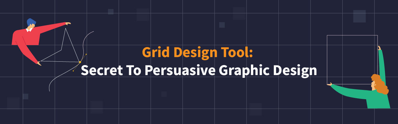
An Introduction To Using Grid Design Tool and Secret To Persuasive Graphic Design
Balakarthiga M - November 19, 2021 - Leave your thoughts.
Starting in 2010, Kenneth has founded four companies and made two exits. Since then, he’s witnessed tectonic levels of change in visual branding both in his business and that of his competitors. If he was up against 2 competitors back in 2010, by 2021, he found that at least 9 new competitors have cropped up in the same niche space.
Gone were the days when posters, offline adverts and flyers made up the entire bundle of a company’s visual branding. Social Media has now brought in a wave of disruption, and business owners like Kenneth have come to understand that companies that ride its crest will outlive the competition.
Identifying and addressing customer aspirations through a brand’s website design or their social media provides an important window into their decision-making process and empowers you to craft messages and visuals that resonate more thoroughly. AI and persuasive graphic design can create clear steps to creating a compelling user journey.
That being said, without some form of sorted structure, it can be hard to know where to look first for inspiration or what design tips might be the most valuable. There are many different ways to use grid layout in order to communicate your message in a persuasive and engaging way. With free online graphic design tools Picmaker, it is possible for even a beginner to make an impact on their audience with stylish photo collage style graphics.
The following article provides all the information you need on the power of grid design - what they are used for, how businesses can use them effectively in creating persuasive content, and even some foolproof steps for instant grid layouts that will grab your audience’s attention and inspire action!
Understanding the Grid System In Graphic Design
Grids are a vital part of graphic design, as they help designers create more organized and consistent layouts. Numerous frameworks exist to help you better understand how grids work. One popular framework includes dividing the page into equal-sized columns and rows, called "grid units."
Grids have been around for a very long time. It's actually one of the oldest layout patterns to exist, and has been used in everything from newspapers to advertisements. A photo grid is just a grid designed for photos. These grids can be vertical or horizontal, and were traditionally used for portfolios or blogs, where there are lots of images to display.
Today, Photo Grids have come a long way.
A photo grid aims to organize several photographs into a single, cohesive idea. The photos can be cropped to fit together nicely. Another benefit of using grids is that the photos will be automatically organized in rows and columns, reducing any need for cropping or rotating them on your screen before uploading them.
Tech Savvy Vs the Tech Curious
Curiosity.
A key trait in successful brand owners. The immunity shot against deaths caused by digital transformation. Silicon valley wild card. It may have killed the cat, but in the 2021 market place, it’s what’s going to keep your business alive in this era of machine learning disruption.
Gone are the days when you had to put yourself at the forefront of the design requirements, hire expensive teams, deploy extensive and complicated softwares that come with a very steep learning curve.
Earlier, there were just two kinds of people. The Tech Savvy, and the Luddites. It was almost a black and white issue. You either had to learn a comprehensive skill, or you got left behind.
Enter DIY tools like Picmaker.
The needs of a tech-curious user were now aggregated with pre-made template style solutions for their design problems. Graphic design plays an important role in the world of visual branding.
And Picmaker is one of the most fundamental tools at your disposal when you are developing for your internet audience. Think of it as your ticket to put your company’s product and service onto an interesting, highly trafficked visual asset – which will in turn give them all the information that they need in order to take action.
Within minutes, you can now create effective, grabbing images and incorporate your captors in your content so that viewers can easily find out more about you and what you have to offer.
Afterall, you cannot ride out the digital transformation wave just by mastering a new technology. You’ll have to bolt-on the benefits offered by the technology into your organisation’s content, culture and future.
With Picmaker, we’ve combined a keen understanding of market trends, client needs, and appropriate learning experiences. We’ve removed the middlemen - freelancers and designers professionals highly conversant in graphic design - and integrated that knowledge into Picmaker, and levelled it up with our darling child - the AI powered MAD button.
In other words, Picmaker is tech savvy on behalf of each of its tech curious users.
Untangling User Experience with Grids
Whether it’s sifting through pop up banners on sites, or instagram stories by brands on social media, or scanning through a company’s tweets - companies today are attacked with a bombardment of graphics that bounces off their heads quickly in most cases. They’re sinking into a culture of fast-paced content consumption and a brand’s biggest challenge is to hold their attention and to spike up user receptivity.
There’s just a four word secret between flurry and fluid graphic design: Grid.
Grid design is a popular design option that creates order from the chaos of overlapping objects. With a simple, flexible grid, designers can create better user experience. Grids are most often used in web and mobile apps to align content in predictable ways without feeling too rigid or oversimplifying it with a layout engine. Many designers feel grids affect the balance between hierarchies and perceived depth in an interface so they apply with care for a specific interface type.
Let’s begin by understanding layering and scaling in graphic design. Using layering and scaling to determine where your content goes, where the text piles up into a description, or using the greater context of a carefully picked stock image to design that detail - is half of the formula for successful photo collage design.
Begin with the most basic question when you take on a photo grid:
How do you arrange the items on a grid?
The hipster answer to this is knowing what feels good.
The Picmaker answer to this mastering dynamic layouts and editing your images with ease.
Knowing how to leverage your layouts using borders and creating a hierarchy of scale that feels well thought out is a great skill to have in your design arsenal. Also, here’s a gospel truth: fonts are either too big or too small, with everything between being obvious garbage.
The mad chaps at Picmaker have cracked this code, and created ready to use grid layouts for you to play with.
All that you have to do is log in to Picmaker.
Choose any template, or start with a blank design.
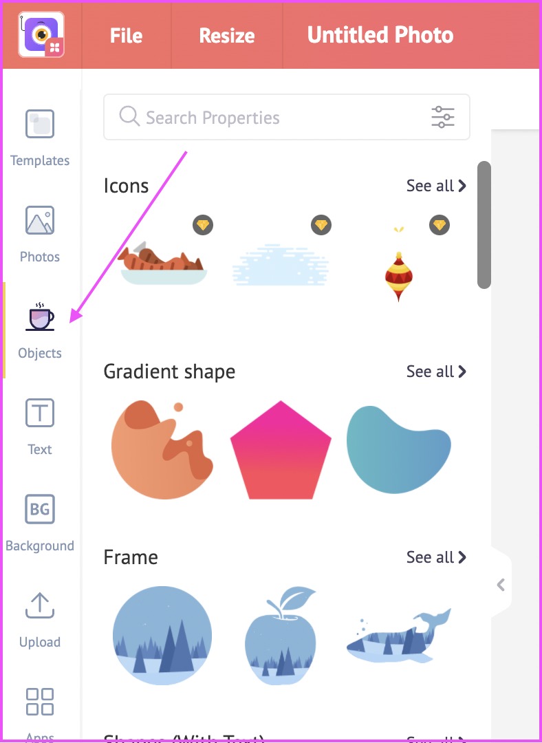
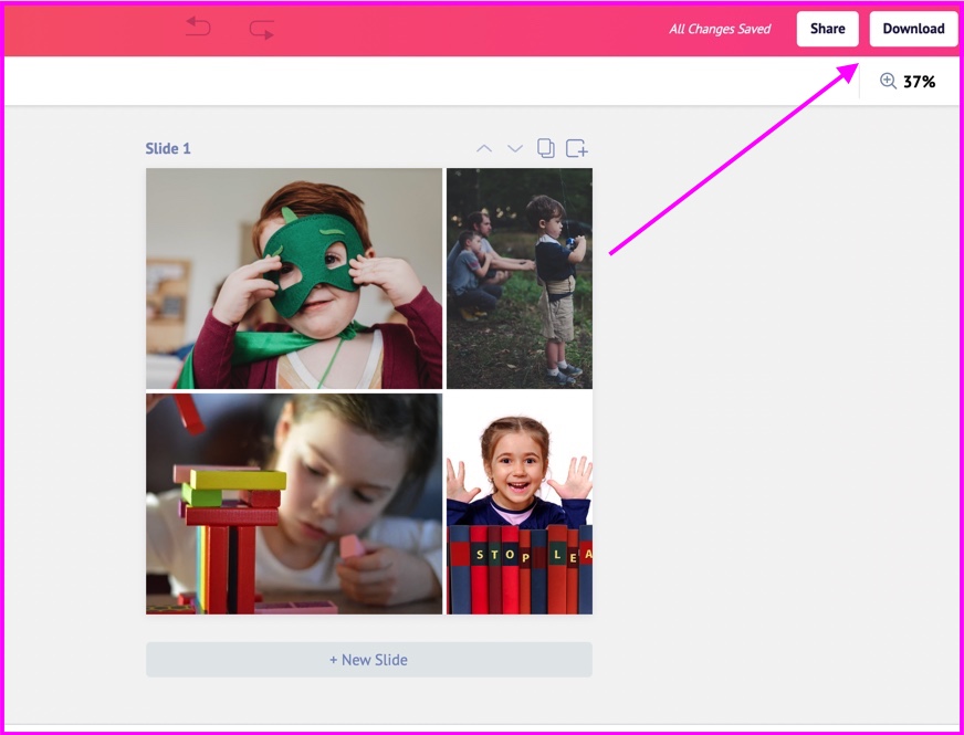
Grids can be located to the left hand side of your screen, under the objects category.
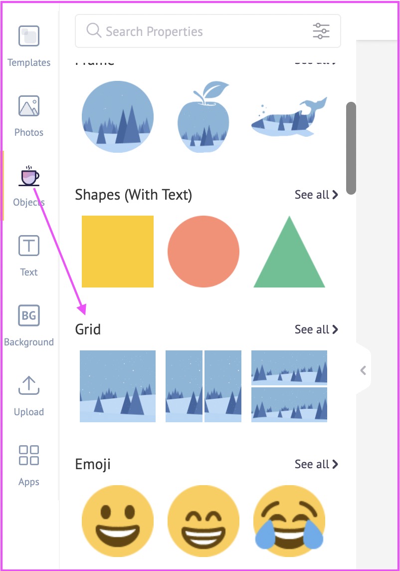
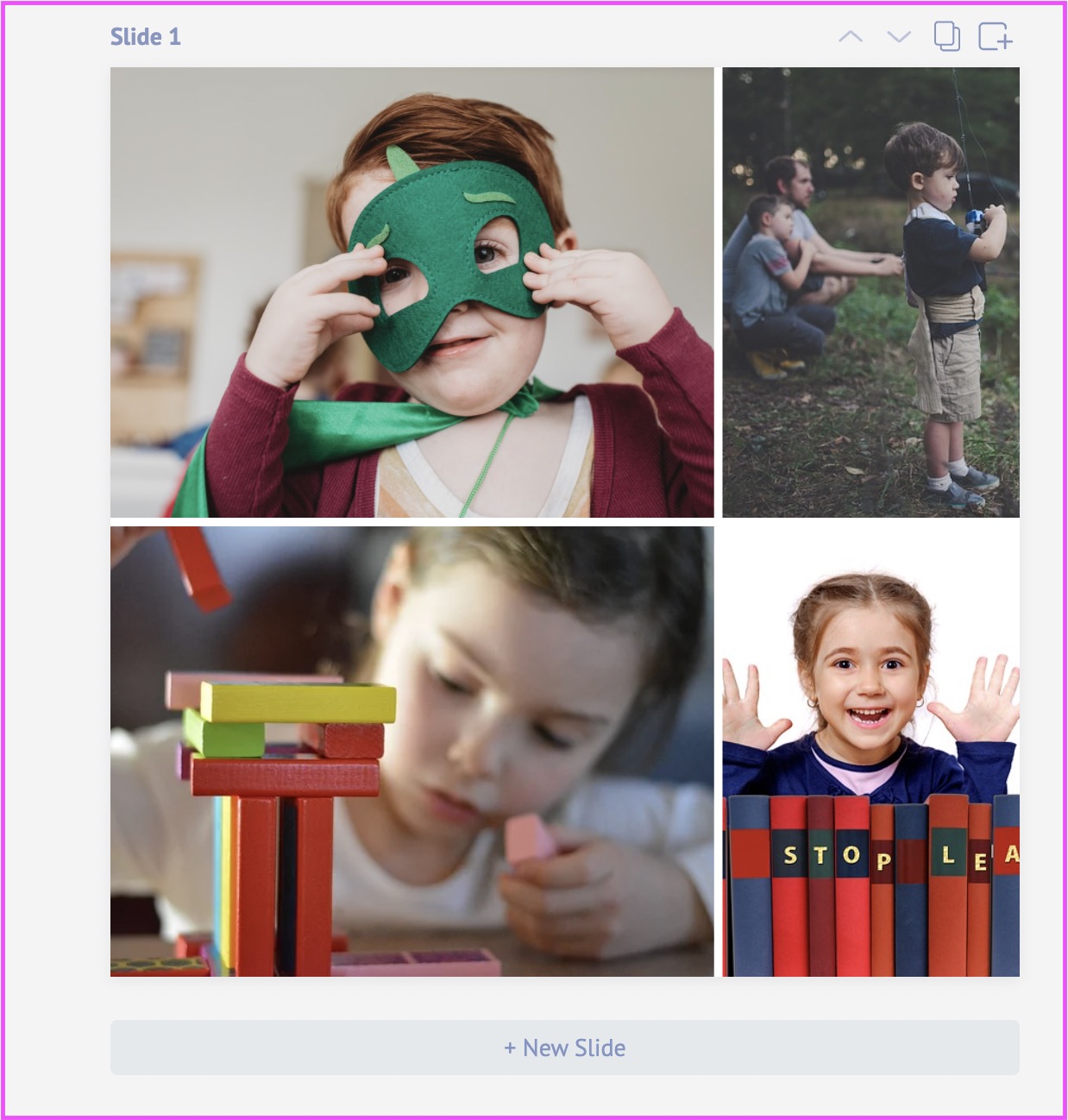
Here, you’ll find both single and multi-frame grids. There are so many versatile ways you can use the grid design layout. Look at this multi-frame grid for example.
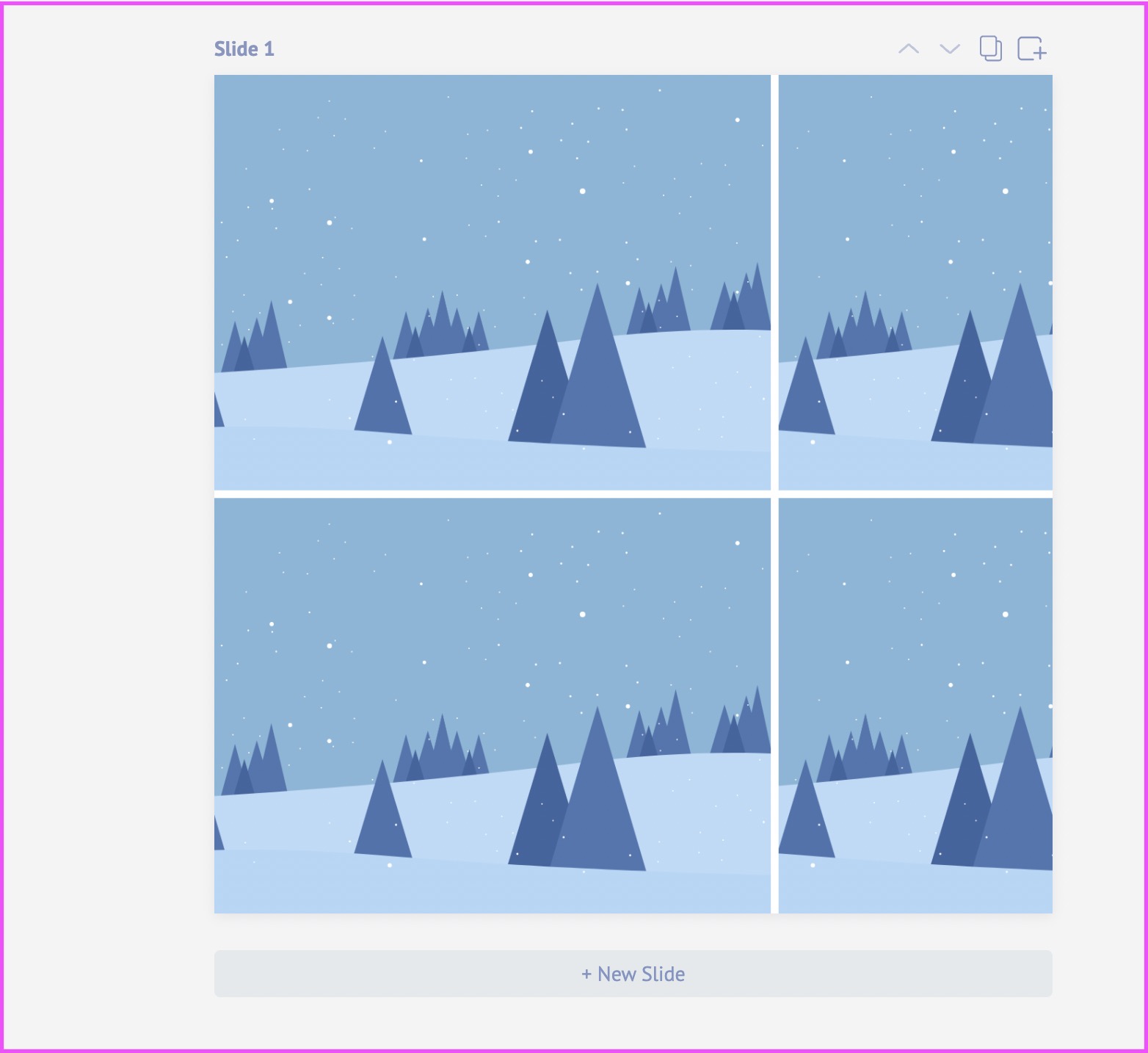
With the holiday season coming up, it’s a great way to share family photos and collages with the world.
Once you select a grid design of your choice, simply add your photos and you're good to go!
You can do so much more customizations with it. For example, you can change the size of the grid. Or, you can enlarge the image in the grid design. You can fill the grid with backgrounds, or solid colours.
You can insert a sequence of images, and add numbers to them, in order to create a narrative.
Once you’re done, you can share it with a teammate, download it to your computer or directly publish it to your favourite social media channels.
Scaling the Unscalable with Collages
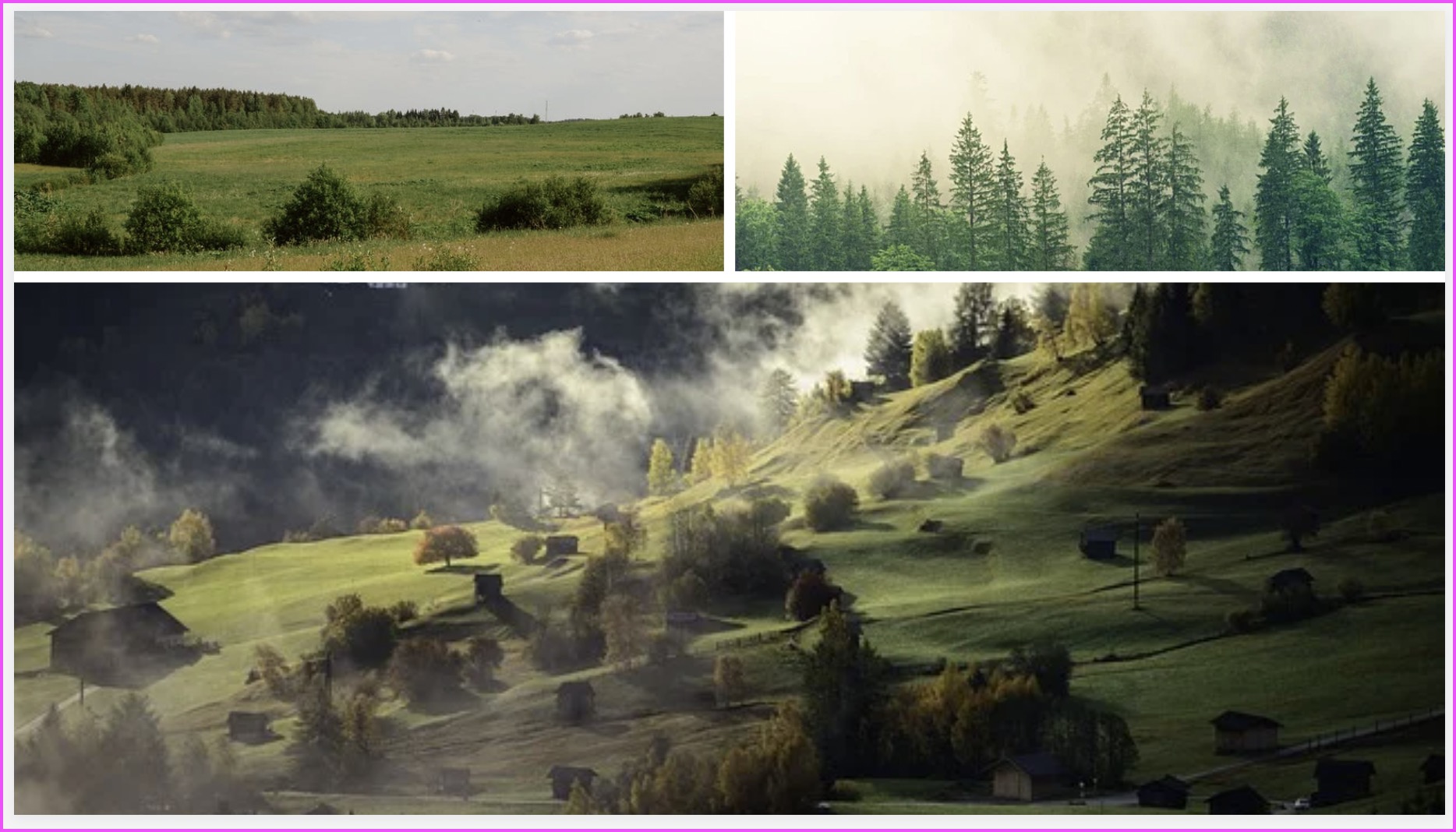
Photo collages are a common strategy for combining images from multiple sources to tell a story. The idea is that by throwing unrelated images together, one will see an interesting result happen as the different points of view come together. For example, one can take three completely different scenes and create a collage which illustrates different moments of an event as it unfolds.
But the average photo collage is still merely an illustration of what left-brain thinkers are trying to say.
Three dishes on a dinner tray means “Thanksgiving dinner.”

A picture of a meadow means “grass is green.”
For the image to really work , it must also make us respond emotionally. If we find a picture sad, happy, creepy or beautiful (or any other emotion), we’re responding to the pre-stimulus effect implanted in our mind by what we see, undefined in the picture itself.
To create a good grid design, the image itself must make us feel in addition to thinking about what we’re looking at.
We need to "play" with the image - that is, let ourselves be playful with the picture. For example, we need to ask ourselves what might be going on in a picture.
A dog looking up at a murder victim.
A spider crawling over a rock only to see himself reflected in the pool of blood below, or a knife plunged into a mound of eggs may be images we see everyday and habitually pass by.
Such seemingly familiar images take on depth and new layers of meaning if we allow ourselves to question them - just as the author of a novel usually includes what is on the surface only as the first clue to uncovering what it means and why it is there.
Only by honestly asking questions such as "Why is the knife sticking out of those eggs?", or "Why is that dog looking at that woman's body?" can we begin to decipher the arrangement of those elements and what they might mean.
You might have heard of the phrase ‘Less is More.’
But when it comes to grid design, Less Is More is visually disconcerting.
Take the above example for example. Behind it is another sub-surface of sub-layers or infinities. We never see all these levels at once, but their mysterious uniting provides the final emotional punch that binds the installation into a completed whole.
Mixing AI and Grid Design Tools For Lovely Graphic Results
Grids are an essential tool of graphic design, the arrangement of elements around a page—lines, photos, text boxes and other objects—to create visual harmony.
But we all know, from owning a computer or a cell phone, just how complex technology can be for a beginner. That makes it seem downright bleak to poke around in what appears to be a never-ending sea of design templates. Here's how you can have fun with Picmaker and create some amazing graphic results using AI.
One of the key challenges in the DIY design industry is to offer ready made templates that can be customised instantaneously but also to make it look boutique and tailor-made.
Picmaker is a revolutionary tool which has unlocked a way to generate unique, customised outputs with our ready-made templates. We’ve applied the magic formula of melting art with AI, and the love child that emerged out of it is our supremely talented MAD button.
Whether you use a ready-made grid layout or start from scratch with a blank design, your graphic design should translate into a clear and effective visual separated into sensible elements that could then be translated automatically.
Here are two demonstrations of how the MAD button works with the multi-grid layout and with a normal single-layout design.
As you can see, from numerous examples of artful design created with the help of intelligible artificial intelligence, the MAD button is a dream come true for many. With the click of a single button, your designs take off without restraint or limitations.
Our home-built Artificial Intelligence provides training sets for neural networks to allow computers to learn how to identify the content of an image, offering innovative and unique suggestions in return.
With our vast and endless library of templates, stock image assets over a 100 million, and a state-of-the-art in intelligent visual design assistant it easy to visualise a marketing campaign, social media post or a web design for your business.
Secret to Persuasive Graphic Design with grids
Creatives use their crafts to communicate ideas effectively.
The complexity of your message can dictate your paragraph layouts, colors and typefaces. The persuasive power of a design depends on the ways an audience engages with it emotionally and intellectually.
A grid layout has many benefits that help designers and conversion rates (think of the price, sale and shipping sections on a website). Some of these benefits include: Helps users find what they need more easily – the column structure tells them where to look. It also draws their eye up and down the page which creates a sense of symmetry and authority.
It eases the flow of your content – useful for you and for your users. Grid layout streamlines your layout, encouraging the user to conduct the actions you see fit. It changes how users process information – they can assimilate more data visually, making it easier for them to digest. It also allows you to use other design principles such as alignment, navigation and visual hierarchy.
A basic grid layout looks great – it offers a simple way to allow the content you lay out to take center stage.
Remember that your grid provides structure and form to your content. Its purpose is to arrange your content in a clear, easy to digest, no fuss way – it is not meant to be
Statistic says that 89% of purchasing decisions are made unconsciously and 99% buyers never go past the headline and few paragraphs. Buyers make up their mind about your product and service at once. So, everything depends on how persuasive and appealing you deliver the message through your design.
It is not meant to be in charge of your layout, nor is it supposed to be in the way. Just provide the framework, don't overcomplicate things by adding meaningless elements just to fill space.
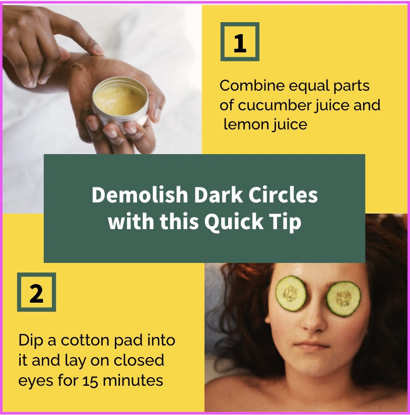
Here are a few examples of grid designs created using Picmaker shared below:
Best of Luck!
Additional Reading:
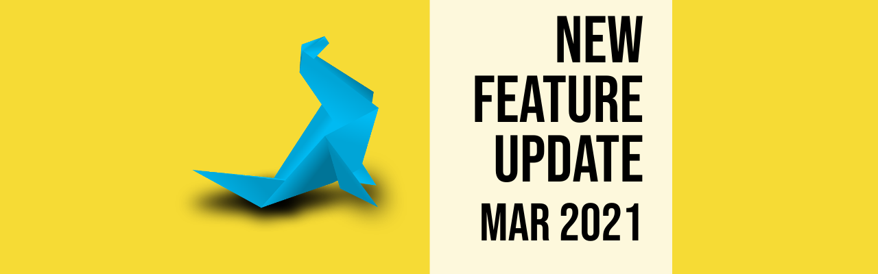
- Feature Update: Learn how to create awesome collages with our ready-to-use grid design layouts for your artwork.
- Looking for the best layouts for social layouts? The complete cheat sheet of social media image sizes for Facebook, Twitter, Instagram, LinkedIn, TikTok, Snapchat, Tumblr, and more.