Contents
Don't be Scared of White Space
Experiment with Muted Color Palettes
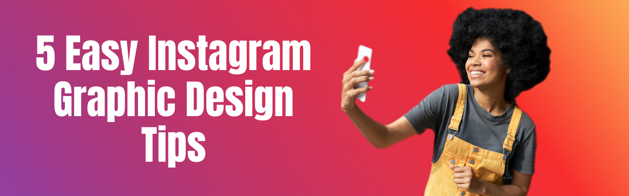
How to Improve the Visibility of Your Instagram Posts? 5 Graphic Design Tips + 11 Free Templates to Put Them into Action
Alyssa Crowell - June 21, 2021 - Leave your thoughts.
There are several reasons why Instagram is the social media platform of choice for everyday users and creatives alike. But, there can be no taking away that it’s beautiful in its simplicity. Because the feed is comprised of photos that you can like or comment on and stories that last for just 24 hours, it’s an easy way to catch up with friends, brands, and artists. Besides, with the number of Instagram users expected to climb to 1.2 billion in two years, it is definitely the place to be.
With so many potential eyes on your profile, it’s essential that you design your posts well enough to maintain your follower count and increase visibility for new ones.
Here are five graphic design tips that you can use to do just that:
Don't be Scared of White Space
While it may feel more comfortable to include several elements in your posts, sometimes it is more effective to use an approach where less is more. White space in graphic design doesn’t necessarily mean using white as a color. It typically refers to areas in your design that are free from text, icons, or other embellishments so that your designs have more impact.
Try incorporating this technique by first avoiding the needless clutter that comes with over-designing. Focus on grouping, adding emphasis, and improving legibility with white space to see the difference it makes. You can also remove extra elements like borders, add spacing between letters, and use padding in your graphics. They could be blog graphics or blog banners which can be created using an online blog banner maker. The result is a cleaner image that is much easier on your followers’ eyes and is more likely to attract a bigger audience.

Use Contrast
Balancing just the right amount of light and dark shades can add more life to any social media graphic design layout. By contrasting colors on your posts, you add more eye-catching elements to your feed that more people will take the time to engage with.
To use contrast effectively, create a color profile that matches your brand’s identity and then use opposing color combinations. For instance, you could use pastel pinks with soft greens or yellow shades against purples. It’s also best to avoid colors that Instagram already uses for itself, so don't use pinks and oranges where possible.

Follow the Best Aspect Ratio
Having a good sense of visual structure is also essential to creating an attractive profile. It’s important, then, to use the best aspect ratio for your photos to get their entirety within the frame. When you’re creating content for your page, you can follow the best Instagram image dimensions outlined by Later, which range from 16:9 all the way to 4:5. Depending on the orientation of the photo, choose the appropriate aspect ratios to resize the dimensions of your images to look their best.
Instagram also supports various aspect ratios for video posts, which should be 30 frames per second and no larger than 4GB. It may help to use an Instagram planner to preview how your feed will look before posting to ensure it looks like a cohesive whole. By doing so, you’re more likely to attract followers who find value in your content.

Experiment with Muted Color Palettes
One trend that is worth trying on Instagram is muted color palettes. Designers have stepped back from bright, bold colors to embrace muted shades such as dusty pinks and soft browns to help the subject matter of posts stand out. In fact, Vox details how brown shades have taken over Instagram, explaining that natural shades reflect colors in everyday surroundings. Such colors tend to work best for health and lifestyle brands.
To experiment with muted tones, start by using your brand colors and create a secondary palette with black or white. After post-processing to get just the right hues, add complementary trends like soft shapes and lines to your graphic. It will create a more modern look for your feed, which in turn helps enhance your visibility on Instagram.

Use In-Feed Color Blocking
One quality that every effective graphic designer has is creativity. Even though social media platforms like Instagram operate on trends, it’s important to set your brand apart with creative posts, which could include collages that are easy to create using an online collage maker. One way to make your feed look more cohesive and professional is to use in-feed color blocking.
There are many ways to do this. Start by choosing photos with similar color schemes and posting them continuously in blocks of 18 to 24 posts. You can also post one large image using several connected posts to add some dimension. This way, your profile will appear more visually interesting and pull more followers in.

Instagram Graphic Design Tips - Conclusion
Graphic design elements can make or break the success of your Instagram profile since it is such a visual platform. By using the basics of good graphic design such as a strong Instagram logo design and a clear theme that aligns with your brand, you can gain visibility and succeed.
Free Instagram Post Templates with the Best Graphic Designs
In the above section, we explored the best graphic design tips for Instagram. Now, let us use readymade templates that match these tips so you can get your posts going in minutes.
Furthermore, all these templates are rightly sized for Instagram at 1080 pixels by 1080 pixels.
Instagram post template #1
This template is ideal for all those of you who run online shops, and use Instagram to promote sales and discounts. It has a contrasting color combination with adequate white space around the center image.

Instagram post template #2
If you dole our food advice and tips on Instagram, then this one is for you. It has easily customizable images, blocks, and text boxes. Its font is casual and ideal for a quick post on Instagram.

Instagram post template #3
If you like to spread the message of global equality, then use this unique template that's one of our favorites. A black background with contrasting fonts make it stand out amongst the crowd.

Instagram post template #4
Without much ado, we know this template is for the festive season. A simple template that has a muted color in the main box, and a vibrant background surrounding it.

Instagram post template #5
This birthday post template is as easy as it gets. The easiest thing to do here is replace the image with a different one and you're all set. Hope you have a good time using this one!

Instagram post template #6
This template can help you put out wedding invitations, which can be created using an invitation maker within minutes. Edit the text in it and change the background color if you wish, and your wedding invitation is ready.

Instagram post template #7
In this template, you can plan for your exhibitions, webinars, online conferences, etc. While we've created it for an online workshop, you can replace the image in it and plan your event.

Instagram post template #8
If you're a party animal, you are going to love this template. While it looks as a new year party invite you can use for all parties, events, and social gatherings.

Instagram post template #9
If you love putting out quotes daily on your Instagram account, then you'll love this one. All you need to do is replace the image in the background, insert your quote in the text box, and post it off.

Instagram post template #10
Since this blog post is about graphic designs for Instagram posts, we decided to introduce one that matches it. But, you can change the details in the text boxes any way you like it.

Instagram post template #11
A lot of times, you may have a need to solicit donations for different causes. Use this template to invite donations and post it onto your Instagram profile.

This blog on Instagram graphic design tips was contributed by Alyssa Crowell. Alyssa is a full-time writer from California. Aside from social media, she enjoys covering the rise of social media, cryptocurrency, and AI technology.
Loved our Instagram graphic design tips? Alrighty! Now, if you're looking for templates and inspiration, don't forget to check out how to create awesome Instagram Stories for your business with Picmaker's Instagram Story Maker.
Besides, if you're looking to create stories that don't look like a flock of sheep, try our Instagram Post Maker.
More than a billion people use Instagram daily. Here’re 7 ways to use Instagram Stories for your business and get more people to notice your brand.