A good logo must create a good impression and kindle curiosity in the audience.
It helps meet a company’s branding objectives, just as it serves as a reference for the audience.
In this tutorial, we'll show you how to design a logo with actionable tips.
3 Logo Design Principles
Knowing the key principles of logo design provides the foundation to create something unique and impressive.
Here are the 3 logo design principles you must follow.
Uniqueness
We can never stress enough the importance of a unique, original logo.
A logo will attract and remain in the memory of the audience only if it’s unique and easily distinguishable.
Think of those that are memorable to you and understand what sets them apart.
That’s a good starting point for designing your own logo.
When you look closely, you’ll probably notice the use of blue in most logo designs.
Blue is the first-choice logo color.
It symbolizes a brand’s professionalism and rationalism, fostering a sense of trust and security in a brand.
Green, purple and red are also good colors to use for your logo to distinguish it.
Magenta, teal, and turquoise are excellent color choices, too.
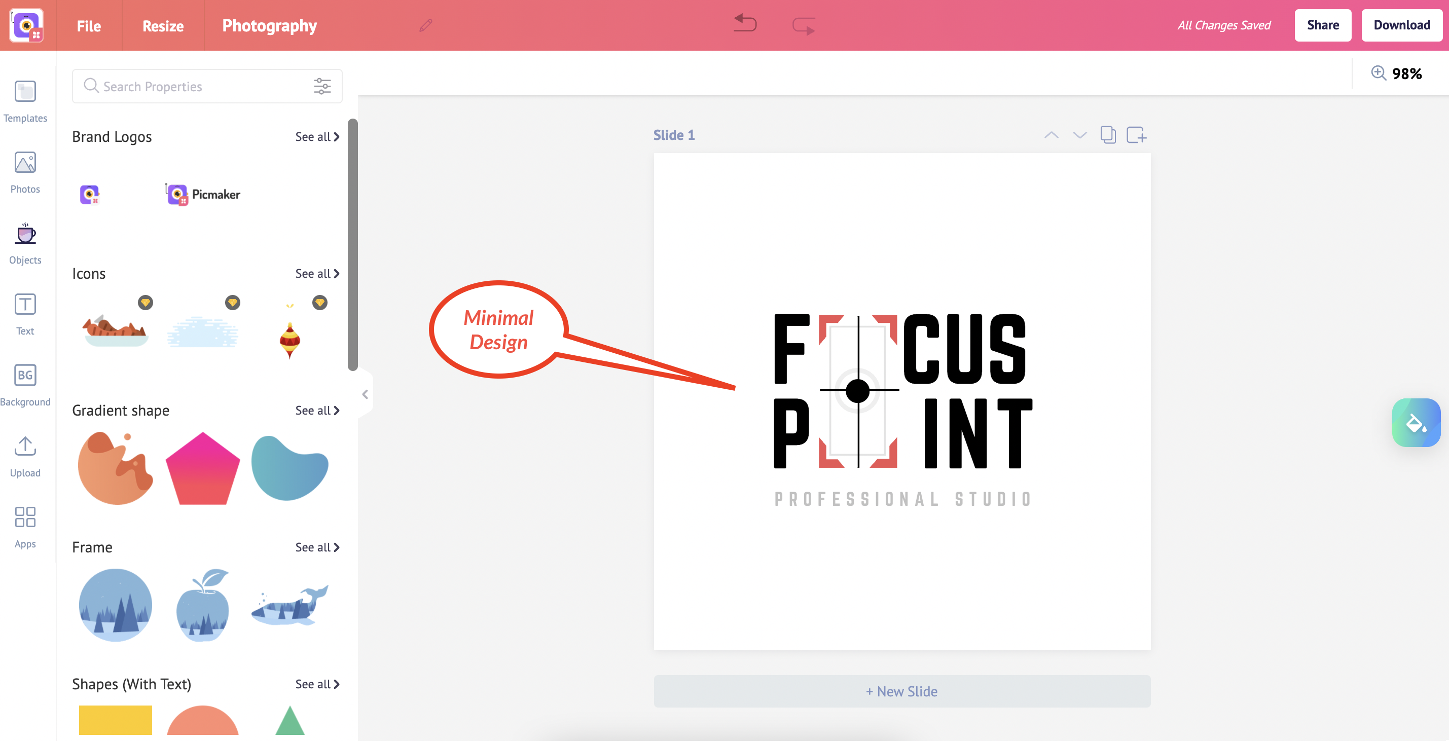
This logo is unique for a professional photography studio.
It is a minimalist design with a unique touch.
Balance + Proportion
Designing a logo with the right balance and proportion is key to appeal to people’s senses.
This essentially refers to the distribution of elements in a design to create a visual appeal.
Not all design elements need to be distributed symmetrically.
But it’s important that color, contrast, typeface, and scale are balanced and have an equilibrium.
Proportion is the weight of each element that’s part of a logo.
Striking the right proportion will give it a wholesome look.
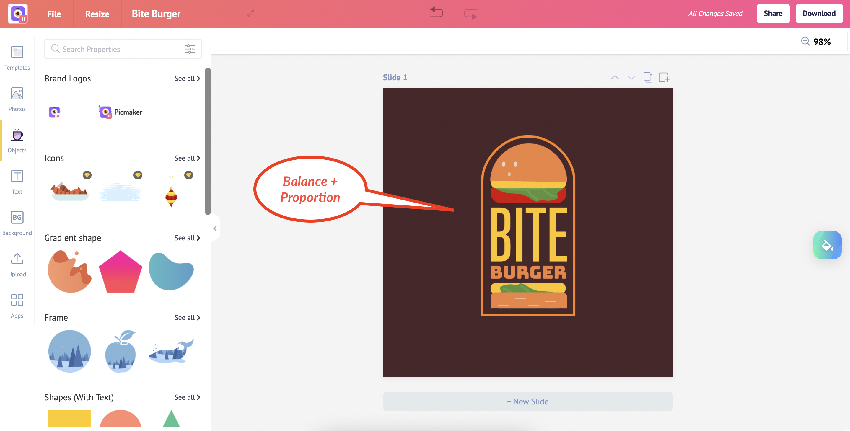
If you look at this logo, it incorporates balance and proportion to give it a professional, wholesome look.
Scalability
Scalable logos are adaptable to different sizes and thus become a voice for your brand anywhere.
They can be printed on large billboards while being adaptable to also be etched on smaller objects.
However, scalable logos must look their original self and be easily recognizable regardless of where they’re printed.
The key to achieving scalability is to not include too many details.
The designer must also create the logo in vector format, which helps with rescaling the design.
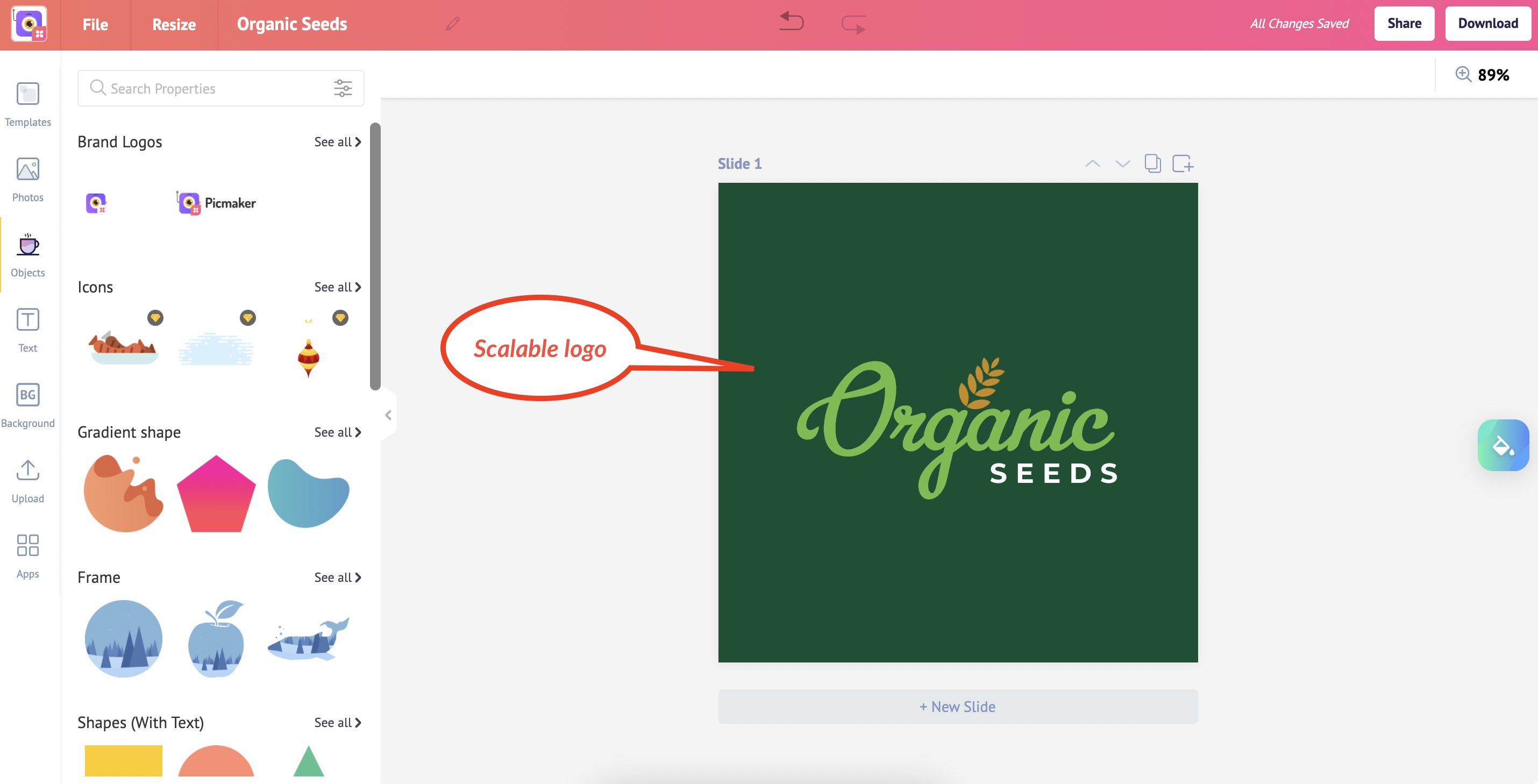
This is an example of a scalable logo.
The designer has opted for simplicity while experimenting with the typeface to lend elegance and ensure it stays in the minds of viewers.
7 Design Tips to Create Your Own Logo
The principles of making a good, impressionable logo might sound simple and clear.
However, knowing where to start and putting your ideas into action can be challenging, whether you're a beginner or someone seasoned with logo design.
The following list of design tips will help you create a unique brand logo.
Pick a legible typography
Choose readable, web-friendly fonts to make your logo design professional. More importantly, using a legible font is key to effectively getting your message across, while retaining the reader’s interest in your logo.
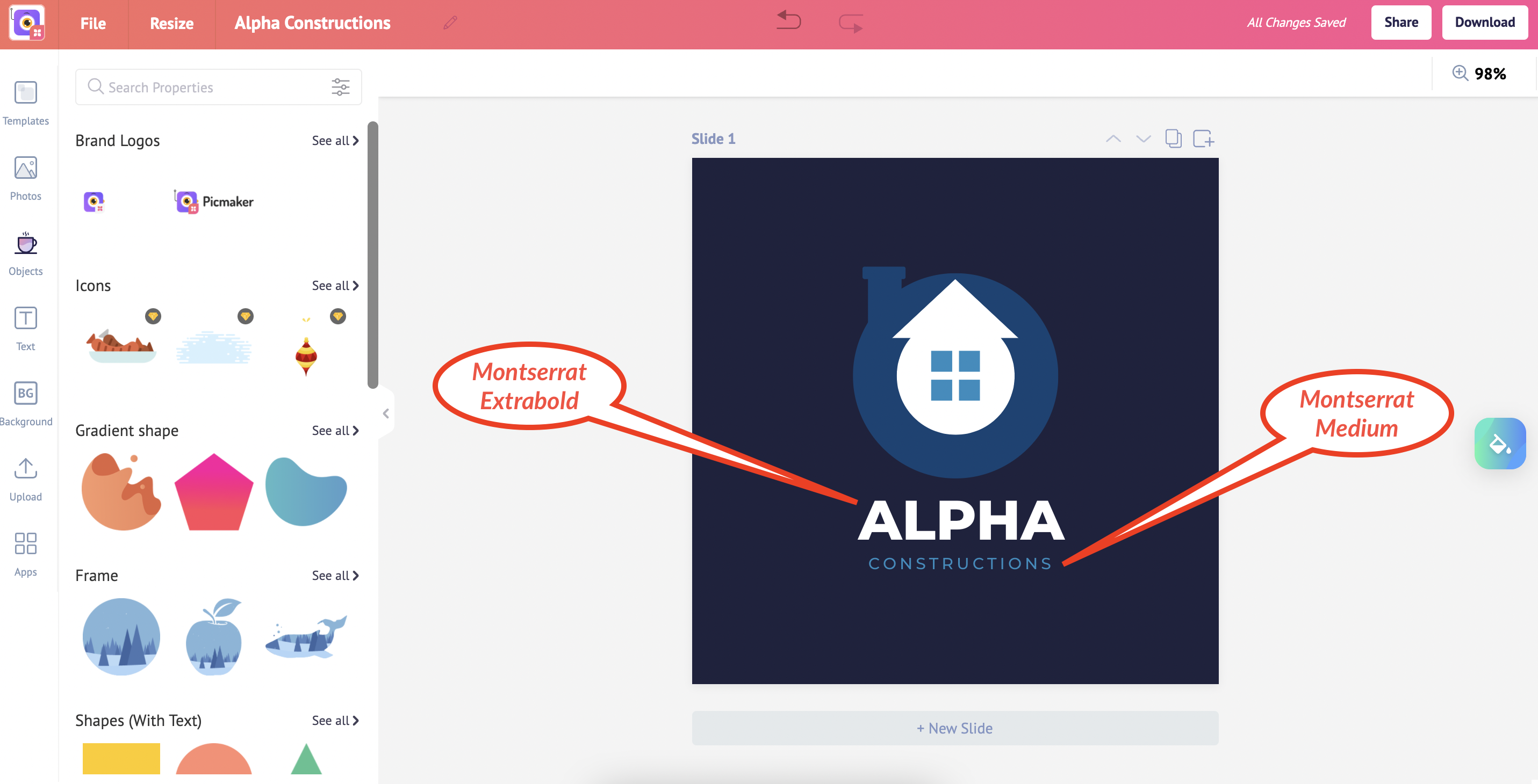
This logo template uses Montserrat font with subfamily “ExtraBold” applied to the title ‘Alpha’ and “Medium” applied to ‘Constructions’.
Not only is Montserrat a great choice of font, here it informs the viewer of the brand name instantly, while the distinction in font sizes makes it memorable.
If you choose a brush script or handwritten font, ensure that the text is legible even if the size is small.
Pick a complementary color palette
Colors have the inherent ability to elicit primal sentiments in people.
A great logo takes advantage of this attribute to emotionally connect with the audience.
Picking a complementary color palette for your logo is a great way to bring out positive feelings in people.
A complementary color palette uses colors that are at opposite ends of the spectrum.
This creates contrast and persuades the viewer to pay attention to the logo.
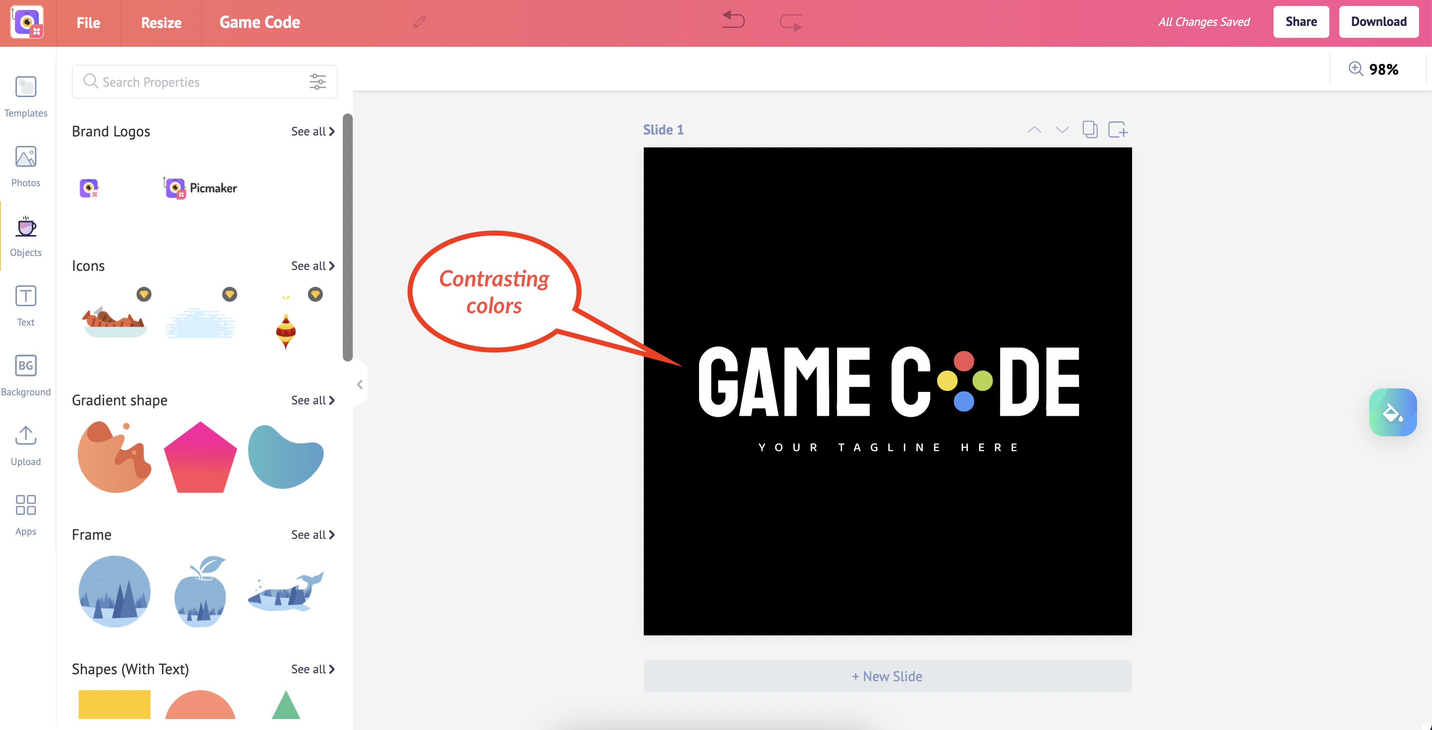
Take this logo as an example.
Black and white provide the maximum contrast possible but are regarded as a contrast of value.
Also, big differences in lightness are pleasant for the human eye.
Along with the choice of color palette, the minimalist design makes it easier for the viewer to focus on the logo.
Ensure all design elements are aligned
Spacing and alignment can make all the difference to a logo.
Essentially, the designer must ensure that text and word spacing, design elements and margins are centered and even.
Proper alignment provides balance to your logo and gets the viewer to focus on the key elements of the design.
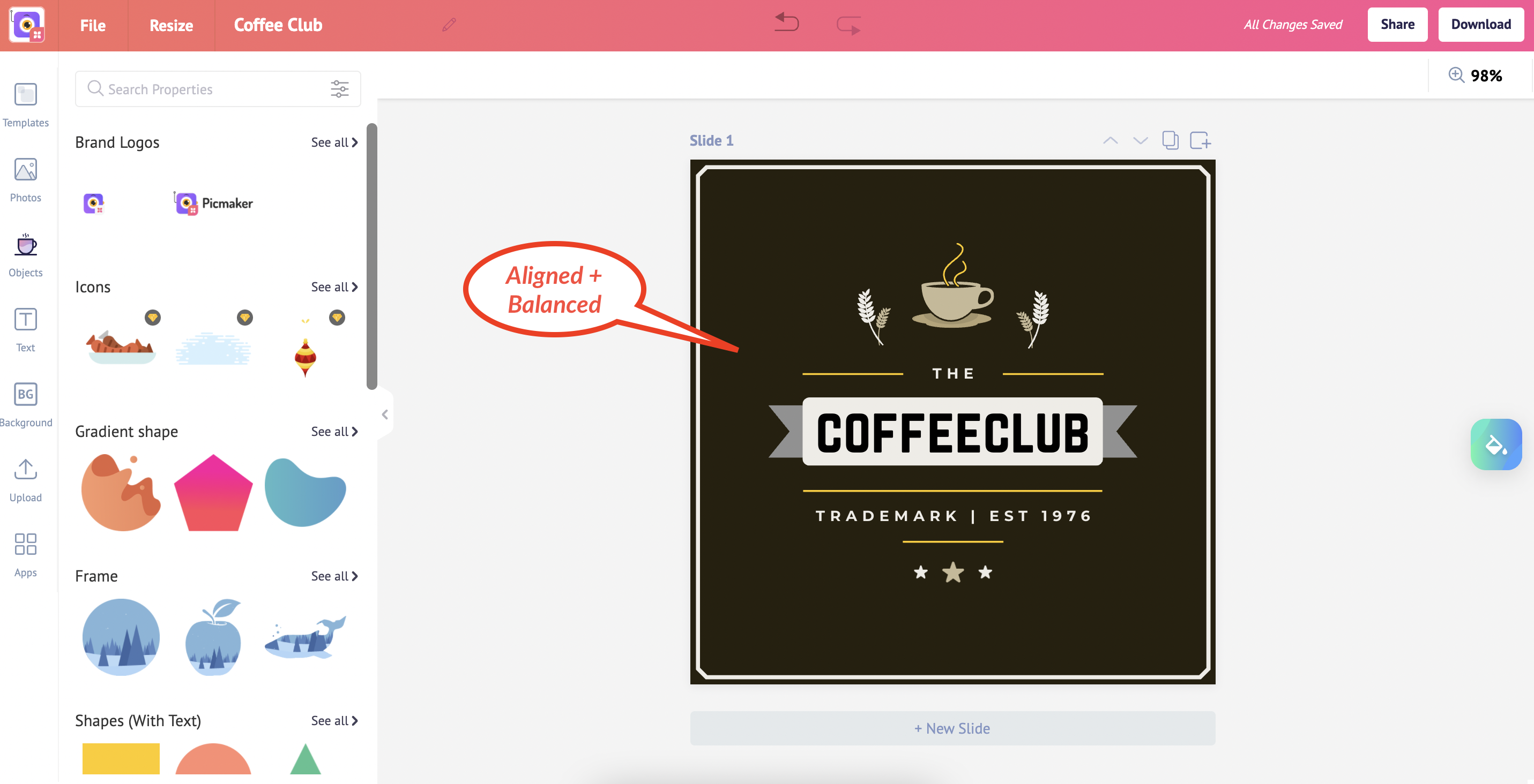
This logo features multiple layers of text along with a cup and saucer set, but everything is aligned and balanced.
The line-spacing is even, which makes the logo uncluttered and easier to focus.
Less is not always less
The saying “Say more with less” is essential to bear in mind when designing a logo.
Not all logos have to be minimalist, of course.
But, if you can create a simple logo that conveys your intended message, then it’s not necessary to crowd the design with undue elements.
Ensure that the visual elements you include create a lasting impression on the viewer.
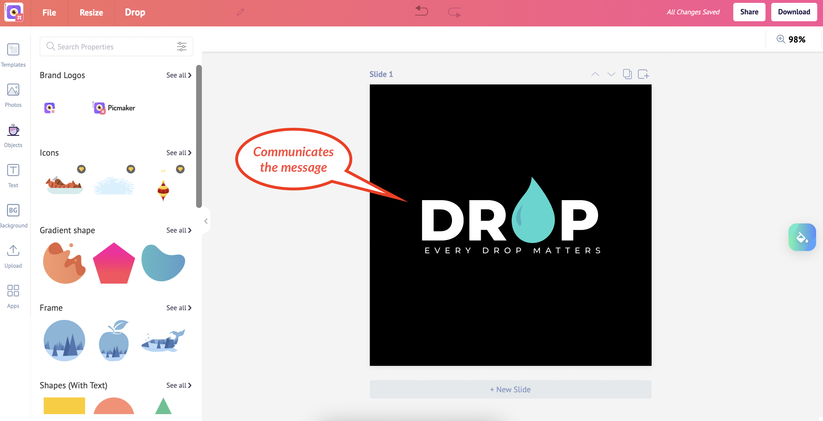
Here’s an example of a minimalist logo that still does its job of communicating the main message.
Use icons to make the logo memorable
Long after a viewer has come across a brand logo, what sticks with them is not the text or the color scheme.
Instead, it’s the iconography that remains in the memory.
Take this logo as an example.
The designer has creatively included the “Knight” as part of the letter ‘h’ to make the logo stand out and memorable for the viewer.
Not only does the icon feel contextual in the way it’s used, but it also stands as a symbol for the chess academy, “Rough Horse”.
Provide an element of surprise
People love mysteries and novelty.
If your logo can capture the viewer’s attention and transfix their eyes on the design longer, it will lead to better memory and recall.
Therefore, once you’ve nailed down the fundamentals of your logo, think how you can add personality with an element of surprise.
After all, what is a logo if it doesn’t reflect the uniqueness of your brand?
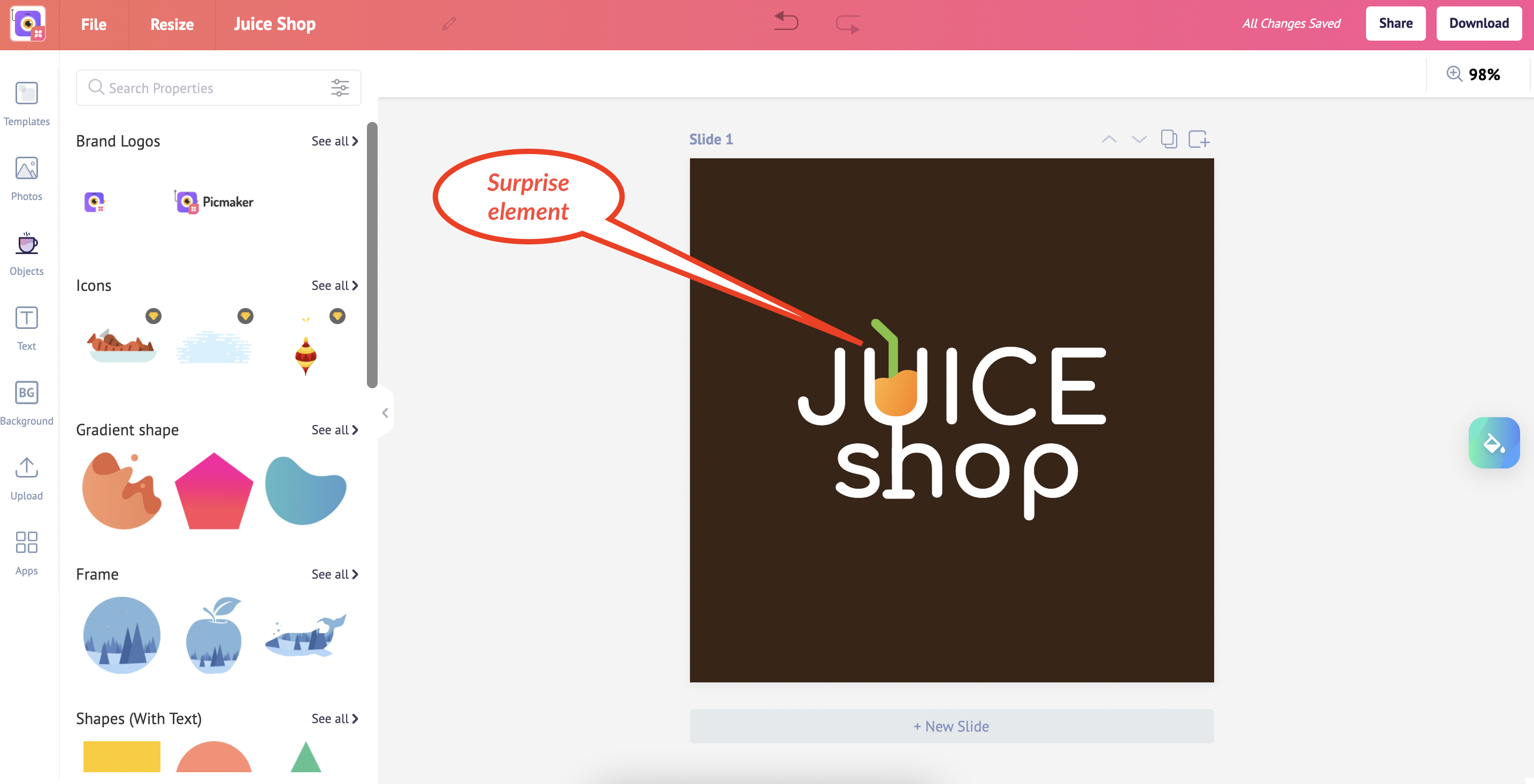
Here’s a logo with an element of surprise.
The letters ‘u’ and ‘h’ are intricately connected to form a glass that contains juice.
While the logo has the brand name “Juice Shop”, the quirk played by the designer makes it more memorable.
At the same time, the logo design is simple and appropriate.
Make your logo timeless
Timelessness is another important trait of an excellent logo.
You don’t want your logo for the time being.
Some logos are updated frequently to retain their freshness, but a great logo today must remain great 10, 15, 30, or even 50 years down the line.
The logo above has the characteristics of a timeless logo.
The designer has incorporated only a few colors, the design is simple but memorable.
And the font used is a geometric, slab-serif typeface that’s suited for print and digital media.
Check out the below tutorials
7 Steps to create a logo from scratch